파이썬 데이터분석 데이터시각화1
- 고객의 정기예금 가입 여부 예측을 위한 은행 마케팅 분류 모델 구축
- 자전거 대여 수요 예측을 위한 머신러닝 모델 구축
- 파이썬 데이터분석 - A/B test 분석
- 파이썬 데이터분석 - aarrr 분석 실습
- 파이썬 데이터분석 - 장바구니 분석(연관분석)2 - FP-Growth, 순차패턴마이닝
- 파이썬 데이터분석 - 장바구니 분석(연관분석) 실습
- 파이썬 데이터분석 - 장바구니 분석(연관분석)
- 파이썬 데이터분석 데이터시각화 실습
- 파이썬 데이터분석 데이터시각화2
- 파이썬 데이터분석 클러스터와 차원축소 실습
- 파이썬 데이터분석 클러스터와 차원축소2
- 파이썬 데이터분석 클러스터와 차원축소
- 파이썬 데이터분석 라이브러리
1
2
3
4
5
6
!pip install koreanize-matplotlib
import koreanize_matplotlib
import pandas as pd
import numpy as np
import seaborn as sns
import matplotlib.pyplot as plt
1
2
3
4
5
6
7
8
9
10
11
12
13
14
15
16
17
Collecting koreanize-matplotlib
Downloading koreanize_matplotlib-0.1.1-py3-none-any.whl.metadata (992 bytes)
Requirement already satisfied: matplotlib in /usr/local/lib/python3.10/dist-packages (from koreanize-matplotlib) (3.7.1)
Requirement already satisfied: contourpy>=1.0.1 in /usr/local/lib/python3.10/dist-packages (from matplotlib->koreanize-matplotlib) (1.3.0)
Requirement already satisfied: cycler>=0.10 in /usr/local/lib/python3.10/dist-packages (from matplotlib->koreanize-matplotlib) (0.12.1)
Requirement already satisfied: fonttools>=4.22.0 in /usr/local/lib/python3.10/dist-packages (from matplotlib->koreanize-matplotlib) (4.53.1)
Requirement already satisfied: kiwisolver>=1.0.1 in /usr/local/lib/python3.10/dist-packages (from matplotlib->koreanize-matplotlib) (1.4.7)
Requirement already satisfied: numpy>=1.20 in /usr/local/lib/python3.10/dist-packages (from matplotlib->koreanize-matplotlib) (1.26.4)
Requirement already satisfied: packaging>=20.0 in /usr/local/lib/python3.10/dist-packages (from matplotlib->koreanize-matplotlib) (24.1)
Requirement already satisfied: pillow>=6.2.0 in /usr/local/lib/python3.10/dist-packages (from matplotlib->koreanize-matplotlib) (10.4.0)
Requirement already satisfied: pyparsing>=2.3.1 in /usr/local/lib/python3.10/dist-packages (from matplotlib->koreanize-matplotlib) (3.1.4)
Requirement already satisfied: python-dateutil>=2.7 in /usr/local/lib/python3.10/dist-packages (from matplotlib->koreanize-matplotlib) (2.8.2)
Requirement already satisfied: six>=1.5 in /usr/local/lib/python3.10/dist-packages (from python-dateutil>=2.7->matplotlib->koreanize-matplotlib) (1.16.0)
Downloading koreanize_matplotlib-0.1.1-py3-none-any.whl (7.9 MB)
[2K [90m━━━━━━━━━━━━━━━━━━━━━━━━━━━━━━━━━━━━━━━━[0m [32m7.9/7.9 MB[0m [31m37.6 MB/s[0m eta [36m0:00:00[0m
[?25hInstalling collected packages: koreanize-matplotlib
Successfully installed koreanize-matplotlib-0.1.1
Matplotlib의 두 가지 인터페이스
- State-based(상태 기반의) 인터페이스
- 꼭 필요한 코드가 아닌 부차적인 코드는 숨겨서 보다 편리한 사용성 제공 object-oriented 방식에 비해 명령어가 생략되며, matplotlib이 알아서 추정해서 동작함
- Object-oriented(객체 지향적) 인터페이스
- 그래프를 구성하는 각각의 요소를 하나씩 구체적으로 짚어가며 구현해야 하는 방식
- 어떤 객체에 어떤 동작이 가해지길 바라는지 명확하게 지시해야 동작함
- 복잡한 명령을 깔끔하게 정리하는데 강점이 있음
Matplotlib의 Object-oriented 인터페이스
- Figure와 Axes
- object-oriented 방식은 그림을 그릴 공간을 준비한 후, 그곳에 캔버스를 얹고, 그 캔버스 위에 그림을 그리는 방식으로 진행된다
- 이때, 그림을 그릴 공간을
Figure, 캔버스를Axes라고 지칭한다 - Figure는 그래프를 담고 있는 최상위 객체로, 그래프가 그려질 빈 공간을 의미한다. 이곳에는 캔버스axes를 한 개 혹은 그 이상을 나타낼 수 있다
- Axes는 Figure안에 들어가는 하위 개념으로 그래프가 들어가는 빈 영역을 의미한다. Axes에는 그래프를 하나만 넣을 수 있다
Object-oriented 방식으로 시각화하기
- object-oriented 방식으로 그래프를 그리려면 가장 먼저, Figure와 Axes를 생성해야 한다.
1
fig, ax = plt.subplots()
1
2
3
4
5
6
7
8
9
10
11
12
# 라인 그래프 구현
import numpy as np

# Figure와 Axes 생성
fig, ax = plt.subplots()

# 2011년부터 2020년까지의 애플 주가 데이터
year_array = np.array([2011, 2012, 2013, 2014, 2015, 2016, 2017, 2018, 2019, 2020])
stock_array = np.array([14.46, 19.01, 20.04, 27.59, 26.32, 28.96, 42.31, 39.44, 73.41, 132.69])

# ax.plot()으로 라인 그래프 시각화
ax.plot(year_array, stock_array)
1
[<matplotlib.lines.Line2D at 0x7adb9a31f280>]
1
2
3
4
5
6
7
8
9
10
# 막대 그래프 시각화
# Figure와 Axes 생성
fig, ax = plt.subplots()

# 학생별 반장선거 득표수 데이터
name_array = np.array(['jimin', 'dongwook', 'hyojun', 'sowon', 'taeho'])
votes_array = np.array([5, 10, 6, 8, 3])

# ax.bar()으로 막대 그래프 시각화
ax.bar(name_array, votes_array)
1
<BarContainer object of 5 artists>
1
2
3
4
5
6
7
8
9
10
11
12
# 산점도 그래프 시각화
# Figure와 Axes 생성
fig, ax = plt.subplots()

# 사람들의 키와 몸무게 데이터
height_array = np.array([165, 164, 155, 151, 157, 162, 155, 157, 165, 162, 165, 167, 167, 183, 180,
                        184, 177, 178, 175, 181, 172, 173, 169, 172, 177, 178, 185, 186, 190, 187])
weight_array = np.array([ 62, 59, 57, 55, 60, 58, 51, 56, 68, 64,57, 58, 64, 79, 73,
                        76, 61, 65, 83, 80, 67, 82, 88, 62, 61, 79, 81, 68, 83, 80])

# ax.scatter()으로 산점도 시각화
ax.scatter(height_array, weight_array)
1
<matplotlib.collections.PathCollection at 0x7adb9a1d4a90>
1
2
3
4
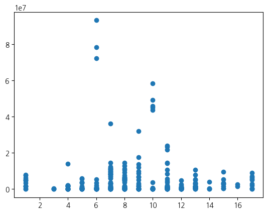
# 아이돌 그룹 멤버들의 활동 기간과 인스타그램 팔로워 수 사이의 관계를 시각화
idol_df = pd.read_csv('/content/drive/MyDrive/코드잇_DA_2기/학습/data/kpop_idols.csv')
fig, ax = plt.subplots()
ax.scatter(idol_df['Career'], idol_df['Followers'])
1
<matplotlib.collections.PathCollection at 0x7adb9716f040>
그래프의 구성 요소 파악
- figure는 1개 이상의 axes(캔버스)를 품고있는 최상위 객체이고, Axes는 그래프가 직접적으로 얹어질 공간을 의미한다
- Axes에는 무조건 x축(x Axis)와 y축(y Axis)가 존재한다. 그리고 각 Axis에 붙는 라벨(label)이나 그래프 제목(title)이 포함될 수 있다
- 각각의 축(Axis)에는 메이저 & 마이너 눈금(Tick)이 존재한다.
- 메이저 눈금은 축을 크게 나눠주는 기본적인 눈금이다
- 마이너 눈금은 메이저 눈금의 사이에 들어가는 세세한 단위의 눈금이다
- 각각의 눈금은 보여줄수도 숨겨줄수도 있다
- 눈금의 간격이나 각 눈금에 붙는 라벨(Tick Label) 역시 조정가능하다
- Spine은 데이터가 들어 있는 영역을 표시해 주는 경계선으로 그래프의 상하좌우 네 군데에 존재하고 보여주거나 제거할 수 있다
- Grid는 데이터포인트의 위치를 쉽게 파악할 수 있도록 배경에 그려두는 격자선이며 눈금과 축에 따라 옵션을 설정할 수 있다
- 범례(Legend)는 각 데이터 계열의 의미를 담고 있는 표식이다. 보통 데이터 계열이 여러개인 경우 범례로 구분해준다
1
2
3
4
5
import pandas as pd

# 데이터셋 준비 : 연령별 연도별 출산율 데이터
birth_df = pd.read_csv('/content/drive/MyDrive/코드잇_DA_2기/학습/data/birth_rate.csv')
birth_df.head()
| 지역 | 시점 | 연령대 | 여성 천명당 출생아수 | |
|---|---|---|---|---|
| 0 | 서울특별시 | 2015 | 15-19세 | 1.0 |
| 1 | 서울특별시 | 2015 | 20-24세 | 6.4 |
| 2 | 서울특별시 | 2015 | 25-29세 | 38.1 |
| 3 | 서울특별시 | 2015 | 30-34세 | 100.4 |
| 4 | 서울특별시 | 2015 | 35-39세 | 49.6 |
1
2
birth_25_29 = birth_df.query('연령대 == "25-29세"')  # 25~29세 데이터만 필터링
birth_30_34 = birth_df.query('연령대 == "30-34세"')  # 30~34세 데이터만 필터링
1
2
3
4
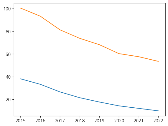
# 라인그래프 시각화
fig, ax = plt.subplots()
ax.plot(birth_25_29['시점'], birth_25_29['여성 천명당 출생아수'])
ax.plot(birth_30_34['시점'], birth_30_34['여성 천명당 출생아수'])
1
[<matplotlib.lines.Line2D at 0x7adb9396b4c0>]
1
2
3
4
5
6
7
8
9
import warnings
warnings.filterwarnings(action='ignore')
plt.rc('font', family='NanumGothic')
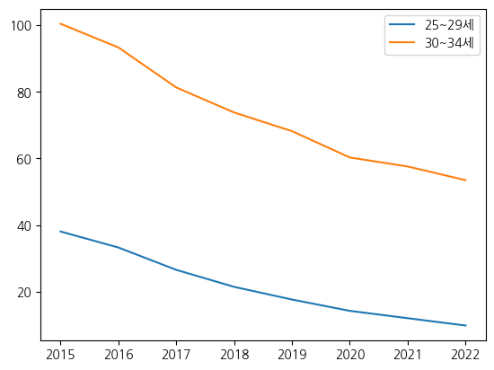
# 범례 붙이기
fig, ax = plt.subplots()
# 범례를 붙이기위해 label만들기
ax.plot(birth_25_29['시점'], birth_25_29['여성 천명당 출생아수'], label='25~29세')
ax.plot(birth_30_34['시점'], birth_30_34['여성 천명당 출생아수'], label='30~34세')
ax.legend() # 범례 붙이기
1
<matplotlib.legend.Legend at 0x7adb93698d90>
1
2
3
4
5
6
7
8
9
10
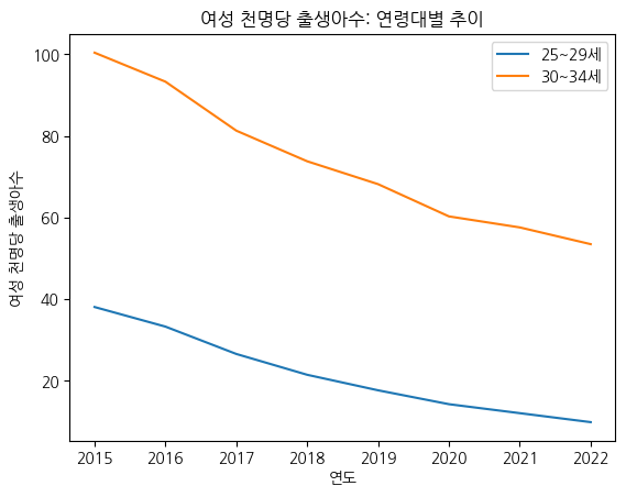
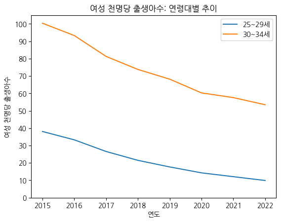
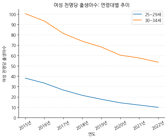
# 제목 및 라벨 붙이기
fig, ax = plt.subplots()
ax.plot(birth_25_29['시점'], birth_25_29['여성 천명당 출생아수'], label='25~29세')
ax.plot(birth_30_34['시점'], birth_30_34['여성 천명당 출생아수'], label='30~34세')
ax.legend() # 범례 붙이기
ax.set_title('여성 천명당 출생아수: 연령대별 추이')
ax.set_xlabel('연도')
ax.set_ylabel('여성 천명당 출생아수')
1
Text(0, 0.5, '여성 천명당 출생아수')
눈금(Tick) 조정하기
- x축 눈금은 set_xticks(), y축 눈금은 set_yticks() 사용
- 대표적으로 3가지 파라미터가 존재함
- ax.set_yticks(눈금의 위치, labels=None, minor=False)
- 눈금의 위치 : 리스트나 array의 형태로 눈금 값을 정리해서 선택
- labels : 라벨의 이름(Tick Label)을 받아 구현해주는 파라미터(생략가능)
- minor : 마이너 눈금을 구현해주는 파라미터(기본값 False)
1
2
3
4
5
6
7
8
9
10
11
12
13
# 눈금(Tick) y축 조정하기
import numpy as np

fig, ax = plt.subplots()
ax.plot(birth_25_29['시점'], birth_25_29['여성 천명당 출생아수'], label='25~29세')  # 범례를 붙이려면, 각각에 label을 꼭 붙여줘야 함
ax.plot(birth_30_34['시점'], birth_30_34['여성 천명당 출생아수'], label='30~34세')
ax.legend() # 범례 붙이기

ax.set_title('여성 천명당 출생아수: 연령대별 추이')  # 제목 붙이기
ax.set_xlabel('연도') # x축 라벨 붙이기
ax.set_ylabel('여성 천명당 출생아수')  # y축 라벨 붙이기

ax.set_yticks(np.arange(0, 110, 10))  # 0 ~ 100까지 10 간격으로 y축 눈금을 표기
1
2
3
4
5
6
7
8
9
10
11
[<matplotlib.axis.YTick at 0x7adb936270a0>,
 <matplotlib.axis.YTick at 0x7adb93626a40>,
 <matplotlib.axis.YTick at 0x7adb93625a80>,
 <matplotlib.axis.YTick at 0x7adb9363b9a0>,
 <matplotlib.axis.YTick at 0x7adb935f0490>,
 <matplotlib.axis.YTick at 0x7adb935f0f40>,
 <matplotlib.axis.YTick at 0x7adb935f19f0>,
 <matplotlib.axis.YTick at 0x7adb9363bee0>,
 <matplotlib.axis.YTick at 0x7adb935f2410>,
 <matplotlib.axis.YTick at 0x7adb935f2ec0>,
 <matplotlib.axis.YTick at 0x7adb935f3970>]
1
2
3
4
5
6
7
8
9
10
11
12
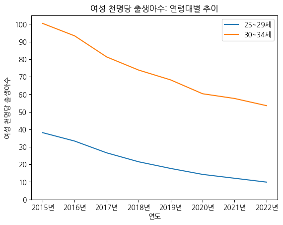
# 눈금 x축 조정하기 : 2015 → 2015년
fig, ax = plt.subplots()
ax.plot(birth_25_29['시점'], birth_25_29['여성 천명당 출생아수'], label='25~29세') # 범례를 붙이려면, 각각에 label을 꼭 붙여줘야 함
ax.plot(birth_30_34['시점'], birth_30_34['여성 천명당 출생아수'], label='30~34세')
ax.legend() # 범례 붙이기
ax.set_title('여성 천명당 출생아수: 연령대별 추이') # 제목 붙이기
ax.set_xlabel('연도') # x축 라벨 붙이기
ax.set_ylabel('여성 천명당 출생아수') # y축 라벨 붙이기
ax.set_yticks(np.arange(0, 110, 10)) # 0 ~ 100까지 10 간격으로 y축 눈금을 표기
ax.set_xticks(birth_25_29['시점'], labels=[f'{i}년' for i in birth_25_29['시점']])
1
2
3
4
5
6
7
8
[<matplotlib.axis.XTick at 0x7adb930b0910>,
 <matplotlib.axis.XTick at 0x7adb930b06d0>,
 <matplotlib.axis.XTick at 0x7adb935b3250>,
 <matplotlib.axis.XTick at 0x7adb930e5b70>,
 <matplotlib.axis.XTick at 0x7adb930e72b0>,
 <matplotlib.axis.XTick at 0x7adb930e7d60>,
 <matplotlib.axis.XTick at 0x7adb930fc850>,
 <matplotlib.axis.XTick at 0x7adb930fd300>]
1
2
3
4
5
6
7
8
9
10
11
12
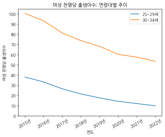
# x 눈금 라벨 회전시키기 : rotation 옵션 사용하기
fig, ax = plt.subplots()
ax.plot(birth_25_29['시점'], birth_25_29['여성 천명당 출생아수'], label='25~29세') # 범례를 붙이려면, 각각에 label을 꼭 붙여줘야 함
ax.plot(birth_30_34['시점'], birth_30_34['여성 천명당 출생아수'], label='30~34세')
ax.legend() # 범례 붙이기
ax.set_title('여성 천명당 출생아수: 연령대별 추이') # 제목 붙이기
ax.set_xlabel('연도') # x축 라벨 붙이기
ax.set_ylabel('여성 천명당 출생아수') # y축 라벨 붙이기
ax.set_yticks(np.arange(0, 110, 10)) # 0 ~ 100까지 10 간격으로 y축 눈금을 표기
ax.set_xticks(birth_25_29['시점'], labels=[f'{i}년' for i in birth_25_29['시점']], rotation=30)
1
2
3
4
5
6
7
8
[<matplotlib.axis.XTick at 0x7adb9315a650>,
 <matplotlib.axis.XTick at 0x7adb93158e20>,
 <matplotlib.axis.XTick at 0x7adb9315bb50>,
 <matplotlib.axis.XTick at 0x7adb931427d0>,
 <matplotlib.axis.XTick at 0x7adb92f04c10>,
 <matplotlib.axis.XTick at 0x7adb92f056c0>,
 <matplotlib.axis.XTick at 0x7adb92f06170>,
 <matplotlib.axis.XTick at 0x7adb92f06c20>]
1
2
3
4
5
6
7
8
9
10
11
12
13
14
15
16
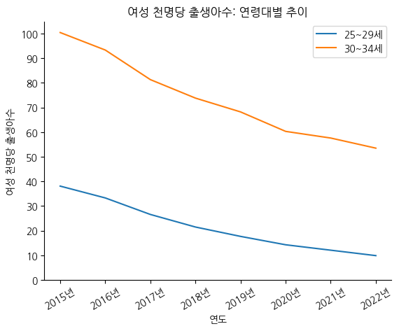
# spine 숨기기
fig, ax = plt.subplots()
ax.plot(birth_25_29['시점'], birth_25_29['여성 천명당 출생아수'], label='25~29세') # 범례를 붙이려면, 각각에 label을 꼭 붙여줘야 함
ax.plot(birth_30_34['시점'], birth_30_34['여성 천명당 출생아수'], label='30~34세')
ax.legend() # 범례 붙이기
ax.set_title('여성 천명당 출생아수: 연령대별 추이') # 제목 붙이기
ax.set_xlabel('연도') # x축 라벨 붙이기
ax.set_ylabel('여성 천명당 출생아수') # y축 라벨 붙이기
ax.set_yticks(np.arange(0, 110, 10)) # 0 ~ 100까지 10 간격으로 y축 눈금을 표기
ax.set_xticks(birth_25_29['시점'], labels=[f'{i}년' for i in birth_25_29['시점']], rotation=30) # 'YYYY년'의 형태로 x라벨 업데이트, 30도 회전
# 상단 및 우측 spine 제거
ax.spines.top.set_visible(False)
ax.spines.right.set_visible(False)
1
2
3
4
5
6
7
8
9
10
11
12
13
14
15
16
17
18
# Grid 생성하기
fig, ax = plt.subplots()
ax.plot(birth_25_29['시점'], birth_25_29['여성 천명당 출생아수'], label='25~29세')  # 범례를 붙이려면, 각각에 label을 꼭 붙여줘야 함
ax.plot(birth_30_34['시점'], birth_30_34['여성 천명당 출생아수'], label='30~34세')
ax.legend() # 범례 붙이기

ax.set_title('여성 천명당 출생아수: 연령대별 추이')  # 제목 붙이기
ax.set_xlabel('연도') # x축 라벨 붙이기
ax.set_ylabel('여성 천명당 출생아수')  # y축 라벨 붙이기

ax.set_yticks(np.arange(0, 110, 10))  # 0 ~ 100까지 10 간격으로 y축 눈금을 표기
ax.set_xticks(birth_25_29['시점'], labels=[f'{i}년' for i in birth_25_29['시점']], rotation=30)   # 'YYYY년'의 형태로 x라벨 업데이트, 30도 회전

# 상단 및 우측 spine 제거
ax.spines.top.set_visible(False)
ax.spines.right.set_visible(False)

ax.grid(axis='y', linestyle=':', color='lightgrey')  # y축에만 Grid 추가, 점선 스타일, 연회색
1
2
3
4
5
6
7
8
9
10
11
12
13
14
15
16
17
18
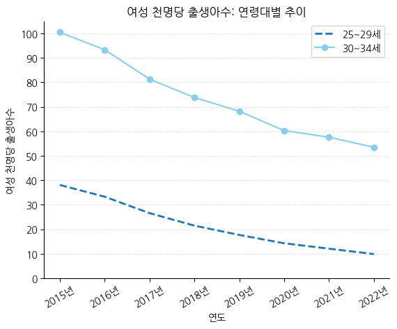
# 그래프 스타일 조정하기
fig, ax = plt.subplots()
ax.plot(birth_25_29['시점'], birth_25_29['여성 천명당 출생아수'], label='25~29세', linewidth=2, linestyle='--') # linewidth, linestyle 설정
ax.plot(birth_30_34['시점'], birth_30_34['여성 천명당 출생아수'], label='30~34세', color='skyblue', marker='o') # line color & marker 설정
ax.legend() # 범례 붙이기
ax.set_title('여성 천명당 출생아수: 연령대별 추이') # 제목 붙이기
ax.set_xlabel('연도') # x축 라벨 붙이기
ax.set_ylabel('여성 천명당 출생아수') # y축 라벨 붙이기
ax.set_yticks(np.arange(0, 110, 10)) # 0 ~ 100까지 10 간격으로 y축 눈금을 표기
ax.set_xticks(birth_25_29['시점'], labels=[f'{i}년' for i in birth_25_29['시점']], rotation=30) # 'YYYY년'의 형태로 x라벨 업데이트, 30도 회전
# 상단 및 우측 spine 제거
ax.spines.top.set_visible(False)
ax.spines.right.set_visible(False)
ax.grid(axis='y', linestyle=':', color='lightgrey') # y축에만 Grid 추가, 점선 스타일, 연회색
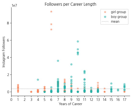
- 실습 가이드
- x축에 아이돌 멤버 각각의 활동 기간을, y축에 인스타그램 팔로워 수를 넣어서 산점도를 그리되, 성별을 기준으로 점을 나눈 후 각각 ‘girl group’, ‘boy group’이라는 라벨을 붙여주세요.
- 점 스타일을 조정해 주세요.
- 걸그룹 데이터 포인트는 투명도 0.5, 별모양(‘*’) 마커, ‘coral’ 컬러를 사용해 주세요
- 보이그룹 데이터 포인트는 투명도 0.5, 펜타곤(‘p’) 모양 마커, ‘lightseagreen’ 컬러를 사용해 주세요.
- ax.scatter()의 파라미터 정보는 공식 문서를 참고해 주세요. (실전에서 직접 문서를 찾아가며 구현할 수 있는 힘을 기르기 위해 이 실습에서는 공식 문서를 참고하며 파라미터를 다루는 법을 연습하도록 설계했습니다. 처음에는 조금 불편하실 수 있지만 몇 번만 시도하면 금방 실력이 느실 거예요! 너무 어렵다면 힌트를 확인해 주세요.)
- ‘Followers per Career Length’라고 제목을 붙여주세요.
- x축에는 ‘Years of Career’, y축에는 ‘Instagram Followers’라고 라벨을 붙여주세요.
- x축의 눈금(Tick) 간격을 조정해 주세요. 0~17년까지 1년 단위로 눈금을 표시해 주세요.
- 상단과 우측의 Spine을 제거해 주세요.
- ax.axhline()을 사용해 평균선을 그려주세요.
- axhline()은 앞에서 배운 적이 없는 함수인데요. 공식 문서를 참고하시면 쉽게 구현하실 수 있을 거예요.
- 걸그룹, 보이그룹 구분 없이 전체 팔로워수 평균값을 사용해 주세요.
- 색상은 ‘grey’, 라인 스타일은 dashed line(‘–’), 라인 두께는 0.5로 설정해 주세요.
- ‘mean’이라고 라벨을 붙여주세요.
- 마지막으로 그래프에 범례(legend)를 붙여주세요.
- 평균선의 라벨까지 범례에 포함되도록 하려면 범례를 생성하는 코드를 ax.axhline() 보다 뒤에 넣어야 한다는 점을 유의해 주세요.
1
2
3
4
5
6
7
8
9
10
11
12
13
14
15
16
17
18
19
20
21
22
23
# 아이돌 그룹 멤버들의 활동 기간과 인스타그램 팔로워 수 사이의 관계를 시각화2
# 걸그룹과 보이그룹 사이에 차이가 있는지 구분해서 표현
# 인스타그램 팔로워수의 평균값을 시각화
idol_df_girl = idol_df.query('Gender == "Girl"')  # 걸그룹 데이터만 필터링
idol_df_boy = idol_df.query('Gender == "Boy"')  # 보이그룹 데이터만 필터링

fig, ax = plt.subplots()
ax.scatter(idol_df_girl['Career'], idol_df_girl['Followers'], label='girl group', alpha=0.5,
           marker='*', c='coral')
ax.scatter(idol_df_boy['Career'], idol_df_boy['Followers'], label='boy group', alpha=0.5,
           marker='p', c='lightseagreen')

ax.set_title('Followers per Career Length')
ax.set_xlabel('Years of Career')
ax.set_ylabel('Instagram Followers')

ax.set_xticks(np.arange(0, 17 + 1, 1))

ax.spines.top.set_visible(False)
ax.spines.right.set_visible(False)

ax.axhline(y=idol_df['Followers'].mean(), color='grey', linestyle='--', lw=0.5, label='mean')
ax.legend()
1
<matplotlib.legend.Legend at 0x7adb92606170>
한 화면에 여러 개의 그래프 그리기
1
2
3
# 두 개의 Axes 다루기 예제 : 소셜 미디어 기업 5개의 2021년 ~ 2022년간의 주식 데이터
sns_df = pd.read_csv('/content/drive/MyDrive/코드잇_DA_2기/학습/data/social_media_stocks.csv')
sns_df.head()
| Date | Symbol | Adj Close | Close | High | Low | Open | Volume | |
|---|---|---|---|---|---|---|---|---|
| 0 | 2012-05-18 | FB | 38.230000 | 38.230000 | 45.000000 | 38.000000 | 42.049999 | 573576400.0 |
| 1 | 2012-05-21 | FB | 34.029999 | 34.029999 | 36.660000 | 33.000000 | 36.529999 | 168192700.0 |
| 2 | 2012-05-22 | FB | 31.000000 | 31.000000 | 33.590000 | 30.940001 | 32.610001 | 101786600.0 |
| 3 | 2012-05-23 | FB | 32.000000 | 32.000000 | 32.500000 | 31.360001 | 31.370001 | 73600000.0 |
| 4 | 2012-05-24 | FB | 33.029999 | 33.029999 | 33.209999 | 31.770000 | 32.950001 | 50237200.0 |
1
sns_df.info()
1
2
3
4
5
6
7
8
9
10
11
12
13
14
15
<class 'pandas.core.frame.DataFrame'>
RangeIndex: 8398 entries, 0 to 8397
Data columns (total 8 columns):
 #   Column     Non-Null Count  Dtype
---  ------     --------------  -----
 0   Date       8398 non-null   object
 1   Symbol     8398 non-null   object
 2   Adj Close  8398 non-null   float64
 3   Close      8398 non-null   float64
 4   High       8398 non-null   float64
 5   Low        8398 non-null   float64
 6   Open       8398 non-null   float64
 7   Volume     8398 non-null   float64
dtypes: float64(6), object(2)
memory usage: 525.0+ KB
1
2
3
4
5
6
7
8
9
# Year 분리
sns_df['Year'] = sns_df['Date'].str.split('-', expand=True)[0]

# 기업별 연도별 평균 주식 종가 계산
sns_close_df = sns_df.groupby(['Year', 'Symbol'])[['Close']].mean().reset_index()

# Meta(Facebook)과 X(Twitter) 데이터 각각 저장
fb_stock_close = sns_close_df.query('Symbol == "FB"')
twtr_stock_close = sns_close_df.query('Symbol == "TWTR"')
1
2
# 2개의 Axes를 갖는 Figure 생성
fig, axes = plt.subplots(1, 2, figsize=(12, 4))
1
2
3
4
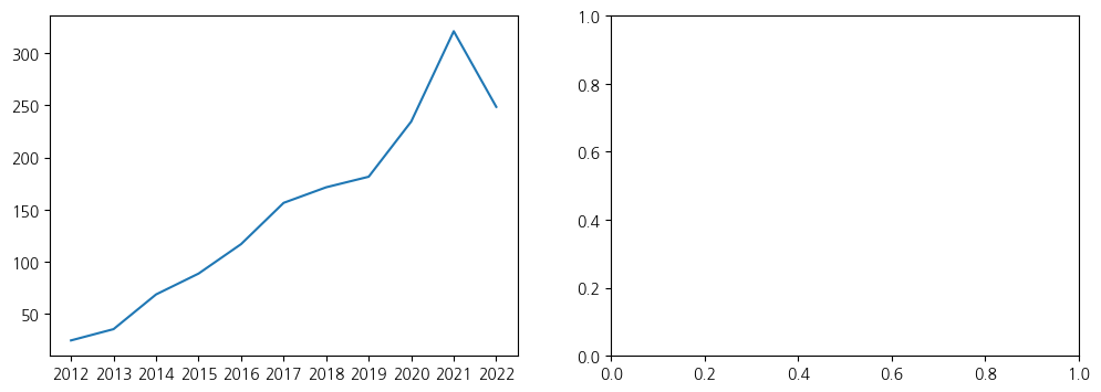
# 첫 번째 Axes에 Meta의 연도별 평균 주식 종가를 시각화
fig, axes = plt.subplots(1, 2, figsize=(12, 4))
axes[0].plot(fb_stock_close['Year'], fb_stock_close['Close'])
1
[<matplotlib.lines.Line2D at 0x7adb92b5e5f0>]
1
2
3
4
5
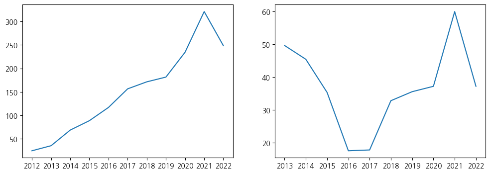
# 두 번째 Axes에 X(Twitter)의 연도별 평균 주식 종가를 시각화
fig, axes = plt.subplots(1, 2, figsize=(12, 4))
axes[0].plot(fb_stock_close['Year'], fb_stock_close['Close'])
axes[1].plot(twtr_stock_close['Year'], twtr_stock_close['Close'])
1
[<matplotlib.lines.Line2D at 0x7adb92d35510>]
1
2
3
4
5
6
7
8
9
10
11
12
13
14
15
16
17
# 두 Axes를 각각 커스터마이징화
fig, axes = plt.subplots(1, 2, figsize=(12, 4))

axes[0].plot(fb_stock_close['Year'], fb_stock_close['Close'], c='teal', marker='o')
axes[0].set_title('Yearly Average Close Price of FB')
axes[0].set_xlabel('Year')
axes[0].set_ylabel('Average Stock Close Price')
axes[0].grid(axis='y', ls='--', c='lightgrey')
axes[0].spines[['top','right']].set_visible(False)


axes[1].plot(twtr_stock_close['Year'], twtr_stock_close['Close'], c='palevioletred', marker='o')
axes[1].set_title('Yearly Average Close Price of TWTR')
axes[1].set_xlabel('Year')
axes[1].set_ylabel('Average Stock Close Price')
axes[1].grid(axis='y', ls='--', c='lightgrey')
axes[1].spines[['top','right']].set_visible(False)

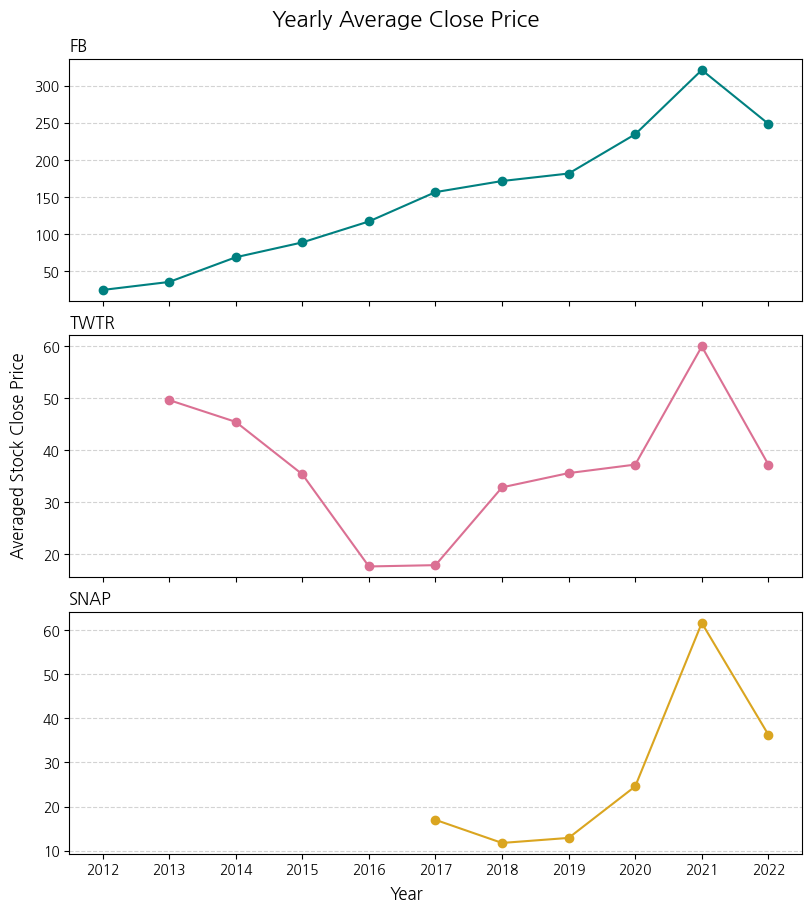
세 개의 Axes 다루기 & 축 공유
sharex옵션 : Axes끼리 x축을 공유함
1
2
3
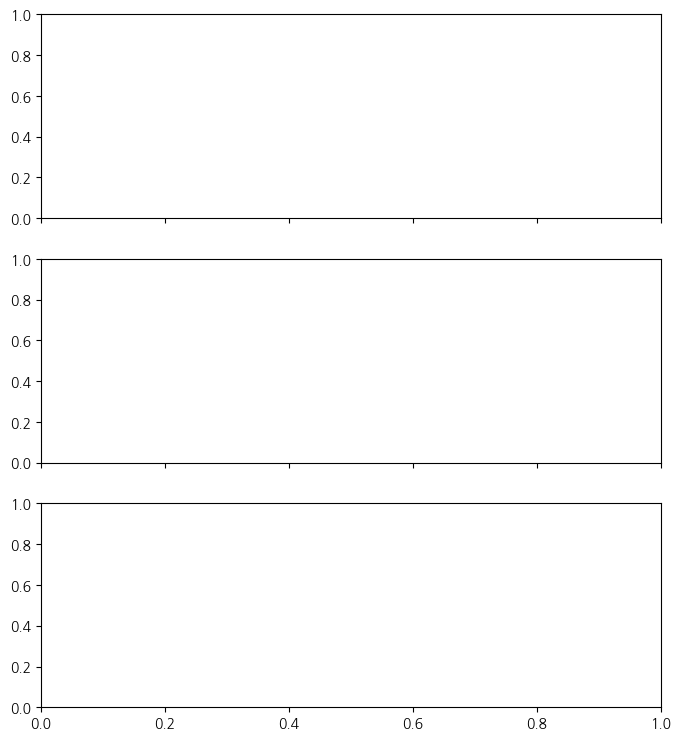
# 세로 방향으로 3개의 Axes
snap_stock_close = sns_close_df.query('Symbol == "SNAP"')
fig, axes = plt.subplots(3, sharex=True, figsize=(8,9))
1
2
3
4
5
6
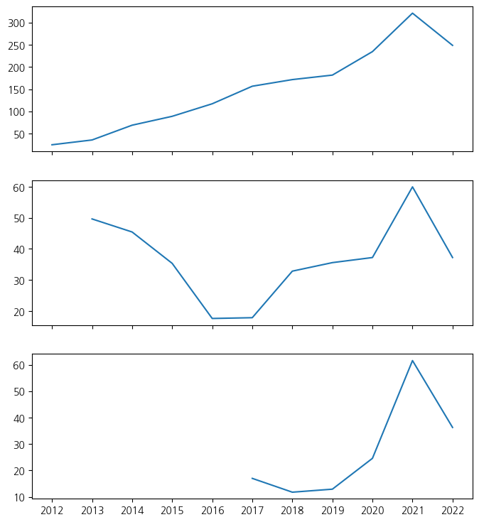
# Meta, X, Snap의 연도별 평균 주식 종가 시각화
fig, axes = plt.subplots(3, sharex=True, figsize=(8,9))
axes[0].plot(fb_stock_close['Year'], fb_stock_close['Close'])
axes[1].plot(twtr_stock_close['Year'], twtr_stock_close['Close'])
axes[2].plot(snap_stock_close['Year'], snap_stock_close['Close'])
1
[<matplotlib.lines.Line2D at 0x7adb922574c0>]
1
2
3
4
5
6
7
8
9
10
11
12
13
14
15
16
17
18
19
20
21
22
23
24
25
26
27
28
29
30
# 3개의 Axes를 각각 커스터마이징화
# constrained_layout : figure 안의 여러 axes들을 둘러싼 여백을 자동으로 적절히 조정
fig, (ax1, ax2, ax3) = plt.subplots(3, sharex=True, figsize=(8, 9), constrained_layout=True)

# ax1: Meta(Facebook)의 연도별 평균 주식 종가
ax1.plot(fb_stock_close['Year'], fb_stock_close['Close'], color='teal', marker='o')

# ax2: X(Twitter)의 연도별 평균 주식 종가
ax2.plot(twtr_stock_close['Year'], twtr_stock_close['Close'], color='palevioletred', marker='o')

# ax3: Snap의 연도별 평균 주식 종가
ax3.plot(snap_stock_close['Year'], snap_stock_close['Close'], color='goldenrod', marker='o')

# Figure 차원의 전체 제목, x & y 라벨 추가
fig.suptitle('Yearly Average Close Price', fontsize=16)
fig.supxlabel('Year')
fig.supylabel('Averaged Stock Close Price')

## ax1 그래프 커스터마이징
ax1.set_title('FB', loc='left')
ax1.grid(axis='y', linestyle='--', color='lightgrey')

## ax2 그래프 커스터마이징
ax2.set_title('TWTR', loc='left')
ax2.grid(axis='y', linestyle='--', color='lightgrey')

## ax3 그래프 커스터마이징
ax3.set_title('SNAP', loc='left')
ax3.grid(axis='y', linestyle='--', color='lightgrey')
object-oriented vs state-based 인터페이스
- 하나의 그래프에서 구성 요소를 조정하는 경우 object-oriented와 state-based 인터페이스 간에 큰 차이는 없다
1
2
3
4
5
6
7
8
9
10
11
12
13
14
15
16
17
18
# object-oriented 인터페이스 기준 하나의 그래프
fig, ax = plt.subplots()
ax.plot(birth_25_29['시점'], birth_25_29['여성 천명당 출생아수'], label='25~29세', linewidth=2, linestyle='--')  # linewidth, linestyle 설정
ax.plot(birth_30_34['시점'], birth_30_34['여성 천명당 출생아수'], label='30~34세', color='skyblue', marker='o')  # line color & marker 설정
ax.legend() # 범례 붙이기

ax.set_title('여성 천명당 출생아수: 연령대별 추이')  # 제목 붙이기
ax.set_xlabel('연도') # x축 라벨 붙이기
ax.set_ylabel('여성 천명당 출생아수')  # y축 라벨 붙이기

ax.set_yticks(np.arange(0, 110, 10))  # 0 ~ 100까지 10 간격으로 y축 눈금을 표기
ax.set_xticks(birth_25_29['시점'], labels=[f'{i}년' for i in birth_25_29['시점']], rotation=30)   # 'YYYY년'의 형태로 x라벨 업데이트, 30도 회전

# 상단 & 우측 spine 제거
ax.spines.right.set_visible(False)
ax.spines.top.set_visible(False)

ax.grid(axis='y', linestyle=':', color='lightgrey')  # y축에만 Grid 추가, 점선 스타일, 연회색

1
2
3
4
5
6
7
8
9
10
11
12
13
14
# 상기 코드를 State-based 인터페이스로 구현
# spines 부분을 제외하면 거의 비슷하다
plt.plot(birth_25_29['시점'], birth_25_29['여성 천명당 출생아수'], label='25~29세', linewidth=2, linestyle='--')  # linewidth, linestyle 설정
plt.plot(birth_30_34['시점'], birth_30_34['여성 천명당 출생아수'], label='30~34세', color='skyblue', marker='o')  # line color & marker 설정
plt.legend() # legend 붙이기

plt.title('여성 천명당 출생아수: 연령대별 추이')  # 제목 붙이기
plt.xlabel('연도') # x축 라벨 붙이기
plt.ylabel('여성 천명당 출생아수')  # y축 라벨 붙이기

plt.yticks(np.arange(0, 110, 10))  # 0 ~ 100까지 10 간격으로 y축 눈금을 표기
plt.xticks(birth_25_29['시점'], labels=[f'{i}년' for i in birth_25_29['시점']], rotation=30)   # 'YYYY년'의 형태로 x라벨 업데이트, 30도 회전

plt.grid(axis='y', linestyle=':', color='lightgrey')  # y축에만 grid 추가, 점선 스타일, 연회색

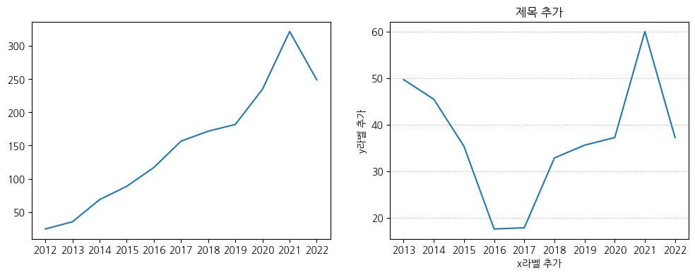
- 여러 개의 Axes를 다루는 경우 차이가 발생한다
- state-based 방식은
plt.subplot()부분을 매번 반복적으로 적어야 한다
- state-based 방식은
1
2
3
4
5
6
7
8
9
plt.figure(figsize=(12, 4))

# 좌측: Meta(Facebook)의 연도별 평균 주식 종가
plt.subplot(1, 2, 1)  # nrows=1 ncols=2, index=1
plt.plot(fb_stock_close['Year'], fb_stock_close['Close'])

# 우측: X(Twitter)의 연도별 평균 주식 종가
plt.subplot(1, 2, 2)  # nrows=1 ncols=2, index=2
plt.plot(twtr_stock_close['Year'], twtr_stock_close['Close'])
1
[<matplotlib.lines.Line2D at 0x7adb92118ac0>]

1
- state-based 인터페이스에서는 Axes가 여러 개일 경우, 가장 최신의(마지막) Axes에만 작업이 진행된다
1
2
3
4
5
6
7
8
9
10
11
12
13
14
15
plt.figure(figsize=(12, 4))

# 좌측: Meta(Facebook)의 연도별 평균 주식 종가
plt.subplot(1, 2, 1)  # nrows=1 ncols=2, index=1
plt.plot(fb_stock_close['Year'], fb_stock_close['Close'])

# 우측: X(Twitter)의 연도별 평균 주식 종가
plt.subplot(1, 2, 2)  # nrows=1 ncols=2, index=2
plt.plot(twtr_stock_close['Year'], twtr_stock_close['Close'])

# 그래프 커스터마이징
plt.title('제목 추가')
plt.xlabel('x라벨 추가')
plt.ylabel('y라벨 추가')
plt.grid(axis='y', linestyle=':')
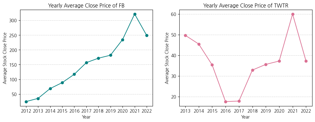
- State-based 방식으로 두 개의 Axes를 생성하고, 각각을 커스터마이징하려면 아래순서를 지켜야한다
- Axes1생성 → Axes1 커스터마이징 → Axes2 생성 → Axes2 커스터마이징
1
2
3
4
5
6
7
8
9
10
11
12
13
14
15
16
17
18
19
plt.figure(figsize=(12, 4))

# 좌측: Meta(Facebook)의 연도별 평균 주식 종가
plt.subplot(1, 2, 1)  # nrows=1 ncols=2, index=1
plt.plot(fb_stock_close['Year'], fb_stock_close['Close'], color='teal', marker='o')

plt.title('Yearly Average Close Price of FB')
plt.xlabel('Year')
plt.ylabel('Average Stock Close Price')
plt.grid(axis='y', linestyle='--', color='lightgrey')

# 우측: X(Twitter)의 연도별 평균 주식 종가
plt.subplot(1, 2, 2)  # nrows=1 ncols=2, index=2
plt.plot(twtr_stock_close['Year'], twtr_stock_close['Close'], color='palevioletred', marker='o')

plt.title('Yearly Average Close Price of TWTR')
plt.xlabel('Year')
plt.ylabel('Average Stock Close Price')
plt.grid(axis='y', linestyle='--', color='lightgrey')
1
2
3
4
5
6
7
8
9
10
11
12
13
14
15
16
17
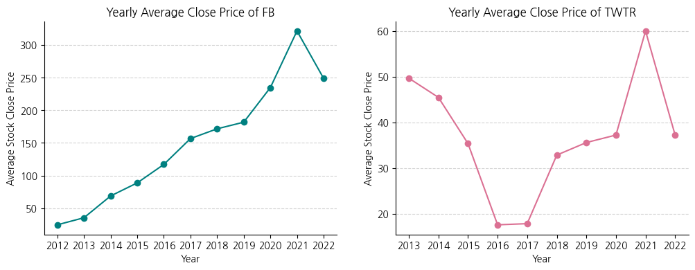
# 위 코드를 object-oriented 방식으로 시각화한다면?
fig, axes = plt.subplots(1, 2, figsize=(12, 4))
# ax1: Meta(Facebook)의 연도별 평균 주식 종가
axes[0].plot(fb_stock_close['Year'], fb_stock_close['Close'], color='teal', marker='o')
# ax2: X(Twitter)의 연도별 평균 주식 종가
axes[1].plot(twtr_stock_close['Year'], twtr_stock_close['Close'], color='palevioletred', marker='o')
axes[0].set_title('Yearly Average Close Price of FB')
axes[1].set_title('Yearly Average Close Price of TWTR')
for ax in axes:
ax.set_xlabel('Year')
ax.set_ylabel('Average Stock Close Price')
ax.grid(axis='y', linestyle='--', color='lightgrey')
ax.spines[['top', 'right']].set_visible(False)
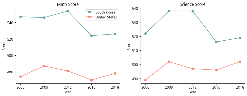
실습 예제 : Matplotlib의 Object-oriented 인터페이스를 기반으로 2개의 Axes를 갖는 Figure를 생성하고, 한국과 미국의 연도별 수학 성적을 비교하는 라인 그래프와 과학 성적을 비교하는 라인 그래프를 가로로 나란히 구현
실습 가이드
- 가로로 Axes가 2개 들어가는 Figure를 생성하되, 사이즈는 (12, 4)로 해주세요.
- 첫 번째 Axes에는 한국(South Korea)와 미국(United States)의 연도별 수학 성적을 보여주는 라인 그래프를 그려주세요.
- 라벨을 각각 ‘South Korea’, ‘United States’로 해서 범례를 추가해 주세요.
- 제목은 ‘Math Score’로 해주세요.
- 두 번째 Axes에는 한국(South Korea)와 미국(United States)의 연도별 과학 성적을 보여주는 라인 그래프를 그려주세요.
- 제목은 ‘Science Score’로 해주세요.
- 아래 내용은 두 Axes의 공통으로 반영해 주세요.
- ‘한국’ 라인의 색상은 ‘cadetblue’로, 마커(Marker)는 원형(‘o’)으로 해주세요.
- ‘미국’ 라인의 색상은 ‘salmon’으로, 마커는 원형(‘o’)으로 해주세요.
- x축에는 ‘Year’, y축에는 ‘Score’라고 라벨을 붙여주세요.
- 상단과 우측의 Spine은 제거해 주세요.
- x축의 눈금(Tick)이 데이터값에 맞춰서 [2006, 2009, 2012, 2015, 2018]로 표시되도록 맞춰주세요.
1
2
pisa_df = pd.read_csv('/content/drive/MyDrive/코드잇_DA_2기/학습/data/pisa_2006_2018.csv')
pisa_df
| Year | Subject | Country | Score | Rank | |
|---|---|---|---|---|---|
| 0 | 2006 | Maths | Albania | NaN | NaN |
| 1 | 2006 | Maths | Algeria | NaN | NaN |
| 2 | 2006 | Maths | Argentina | NaN | NaN |
| 3 | 2006 | Maths | Australia | 520.0 | 12.0 |
| 4 | 2006 | Maths | Austria | 505.0 | 17.0 |
| ... | ... | ... | ... | ... | ... |
| 1107 | 2018 | Reading | Morocco | 359.0 | 74.0 |
| 1108 | 2018 | Reading | Kosovo | 353.0 | 75.0 |
| 1109 | 2018 | Reading | Lebanon | 353.0 | 75.0 |
| 1110 | 2018 | Reading | Dominican Republic | 342.0 | 77.0 |
| 1111 | 2018 | Reading | Philippines | 340.0 | 78.0 |
1112 rows × 5 columns
1
pisa_df['Country'].unique()
1
2
3
4
5
6
7
8
9
10
11
12
13
14
15
16
17
18
19
array(['Albania', 'Algeria', 'Argentina', 'Australia', 'Austria',
       'China B-S-J-G', 'Belgium', 'Brazil', 'Bulgaria', 'Argentina CABA',
       'Canada', 'Chile', 'Taiwan', 'Colombia', 'Costa Rica', 'Croatia',
       'Cyprus', 'Czech Republic', 'Denmark', 'Dominican Republic',
       'Estonia', 'Finland', 'France', 'Macedonia', 'Georgia', 'Germany',
       'Greece', 'Hong Kong', 'Hungary', 'Iceland', 'Indonesia',
       'Ireland', 'Israel', 'Italy', 'Japan', 'Jordan', 'Kazakhstan',
       'South Korea', 'Kosovo', 'Latvia', 'Lebanon', 'Lithuania',
       'Luxembourg', 'Macau', 'Malaysia', 'Malta', 'Mexico', 'Moldova',
       'Montenegro', 'Netherlands', 'New Zealand', 'Norway', 'Peru',
       'Poland', 'Portugal', 'Qatar', 'Romania', 'Russia', 'Singapore',
       'Slovakia', 'Slovenia', 'Spain', 'Sweden', 'Switzerland',
       'Thailand', 'Trinidad and Tobago', 'Tunisia', 'Turkey',
       'United Arab Emirates', 'United Kingdom', 'United States',
       'Uruguay', 'Vietnam', 'China (B-S-J-Z)', 'Macau(China)',
       'Hong Kong (China)', 'Belarus', 'Ukraine', 'Serbia', 'Brunei',
       'Azerbaijan', 'Bosnia and Herzegovina', 'North Macedonia',
       'Saudi Arabia', 'Morocco', 'Panama', 'Philippines',
       'Macau (China)'], dtype=object)
1
pisa_df['Subject'].unique()
1
array(['Maths', 'Science', 'Reading'], dtype=object)
1
2
3
4
5
6
7
8
pisa_df_korea = pisa_df.query('Country == "South Korea"')
pisa_df_usa = pisa_df.query('Country == "United States"')

pisa_df_korea_math = pisa_df_korea.query('Subject == "Maths"')
pisa_df_usa_math = pisa_df_usa.query('Subject == "Maths"')

pisa_df_korea_sc = pisa_df_korea.query('Subject == "Science"')
pisa_df_usa_sc = pisa_df_usa.query('Subject == "Science"')
1
pisa_df_korea_math
| Year | Subject | Country | Score | Rank | |
|---|---|---|---|---|---|
| 37 | 2006 | Maths | South Korea | 547.0 | 4.0 |
| 110 | 2009 | Maths | South Korea | 546.0 | 3.0 |
| 183 | 2012 | Maths | South Korea | 554.0 | 4.0 |
| 256 | 2015 | Maths | South Korea | 524.0 | 7.0 |
| 882 | 2018 | Maths | South Korea | 526.0 | 7.0 |
1
2
3
4
5
6
7
8
9
10
11
12
13
14
15
16
17
18
fig, axes = plt.subplots(1, 2, figsize=(12,4))

axes[0].plot(pisa_df_korea_math['Year'], pisa_df_korea_math['Score'], label='South Korea', c='cadetblue', marker='o')
axes[0].plot(pisa_df_usa_math['Year'], pisa_df_usa_math['Score'], label='United States', c='salmon', marker='o')
axes[0].legend()
axes[0].set_title('Math Score')
axes[0].set_xlabel('Year')
axes[0].set_ylabel('Score')
axes[0].spines[['top','right']].set_visible(False)
axes[0].set_xticks(np.arange(2006, 2018+1, 3))

axes[1].plot(pisa_df_korea_sc['Year'], pisa_df_korea_sc['Score'], c='cadetblue', marker='o')
axes[1].plot(pisa_df_usa_sc['Year'], pisa_df_usa_sc['Score'], c='salmon', marker='o')
axes[1].set_title('Science Score')
axes[1].set_xlabel('Year')
axes[1].set_ylabel('Score')
axes[1].spines[['top','right']].set_visible(False)
axes[1].set_xticks(np.arange(2006, 2018+1, 3))
1
2
3
4
5
[<matplotlib.axis.XTick at 0x7adb8bfed8a0>,
 <matplotlib.axis.XTick at 0x7adb8bfef5b0>,
 <matplotlib.axis.XTick at 0x7adb8bfedc30>,
 <matplotlib.axis.XTick at 0x7adb91f77d00>,
 <matplotlib.axis.XTick at 0x7adb91f75060>]
This post is licensed under CC BY 4.0 by the author.