파이썬 데이터분석 데이터시각화2
- 고객의 정기예금 가입 여부 예측을 위한 은행 마케팅 분류 모델 구축
- 자전거 대여 수요 예측을 위한 머신러닝 모델 구축
- 파이썬 데이터분석 - A/B test 분석
- 파이썬 데이터분석 - aarrr 분석 실습
- 파이썬 데이터분석 - 장바구니 분석(연관분석)2 - FP-Growth, 순차패턴마이닝
- 파이썬 데이터분석 - 장바구니 분석(연관분석) 실습
- 파이썬 데이터분석 - 장바구니 분석(연관분석)
- 파이썬 데이터분석 데이터시각화 실습
- 파이썬 데이터분석 데이터시각화1
- 파이썬 데이터분석 클러스터와 차원축소 실습
- 파이썬 데이터분석 클러스터와 차원축소2
- 파이썬 데이터분석 클러스터와 차원축소
- 파이썬 데이터분석 라이브러리
1
2
3
import pandas as pd
import numpy as np
import seaborn as sns
Seaborn 라이브러리
- seaborn은 matplotlib을 기반으로 하는 라이브러리이다
- seaborn은
Figure-level과Axes-level두 가지 타입의 함수를 지원한다 - Figure-level 함수 하나에 여러 개의 Axes-level 함수가 대응되는 1:N의 관계를 가진다
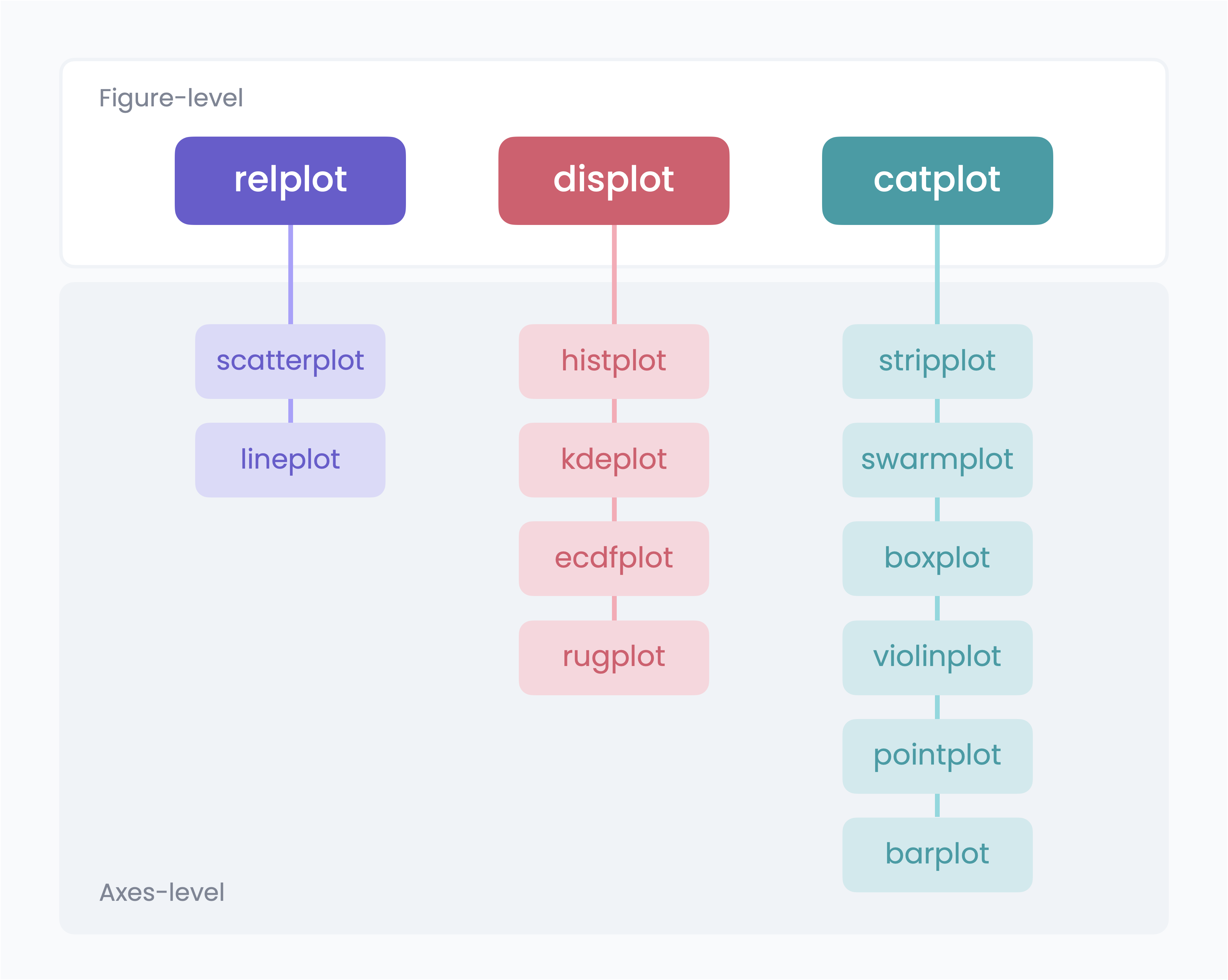
Axes-level함수는 Axes를 생성하는 그래프 시각화 함수로 Matplotlib에서 지원되는 State-based 방식이나 Object-oriented 방식 모두 커스터마이징 가능하다Figure-level함수는 Figure 자체를 생성하는 그래프 시각화 함수로 하나의 함수로 복수의 Axes를 생성하지만 Matplotlib의 Axes 레벨 함수로는 추가적인 가공이 어렵다
1
2
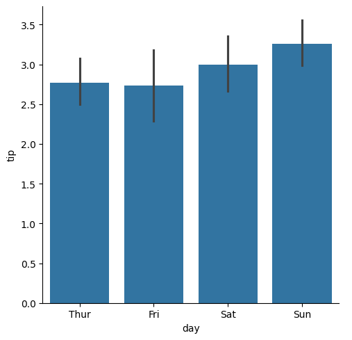
tips_df = sns.load_dataset('tips') # Seaborn의 기본 데이터셋 중 하나
sns.catplot(data=tips_df, x='day', y='tip', kind='bar') # Figure-level 함수
1
<seaborn.axisgrid.FacetGrid at 0x7afb7c274b50>
1
sns.barplot(data=tips_df, x='day', y='tip') # Axes-level 함수
1
<Axes: xlabel='day', ylabel='tip'>
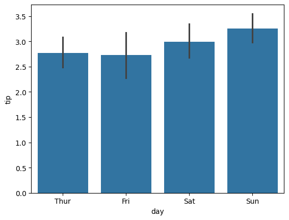
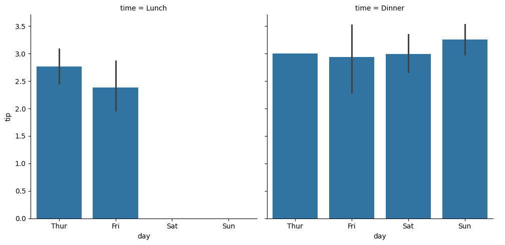
Figure-level 함수의 장점 : 그래프 쪼개 그리기
- Figure-level 함수는 Figure 레벨 객체를 생성하는 것이기에, 함수 하나만으로 복수의 Subplot을 가진 Figure를 생성할 수 있다
- 열
col이나 행row기준으로 데이터를 나누어 시각화 할 수 있다
- 열
1
2
# 점심과 저녁 사이의 팁 차이가 있을까?
sns.catplot(data=tips_df, x='day', y='tip', kind='bar', col='time')
1
<seaborn.axisgrid.FacetGrid at 0x7afb7d1a2e90>
1
2
3
# 점심과 저녁 사이의 팁차이는 큰 차이가 없어보인다
# 성별에 따른 팁 차이가 있을까?
sns.catplot(data=tips_df, x='day', y='tip', kind='bar', col='time', row='sex')
1
<seaborn.axisgrid.FacetGrid at 0x7afb3af3f160>
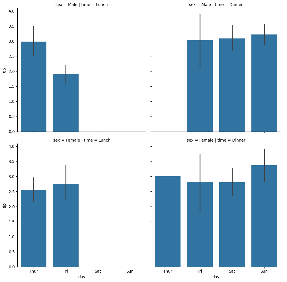
Figure-level 함수 catplot()
categorical plot의 줄임으로 카테고리별 수치 비교 목적의 시각화에 적합한 함수sns.catplot(kind='bar')처럼kind를 지정하는 방식으로 다양한 종류의 시각화를 지원함- kind 옵션 : strip, swarm, box, violin, boxen, point, bar, count
막대그래프 시각화
1
2
customer_df = pd.read_csv('/content/drive/MyDrive/data/customer_personality.csv', sep='\t')
customer_df
| ID | Year_Birth | Education | Marital_Status | Income | Kidhome | Teenhome | Dt_Customer | Recency | MntWines | ... | NumWebVisitsMonth | AcceptedCmp3 | AcceptedCmp4 | AcceptedCmp5 | AcceptedCmp1 | AcceptedCmp2 | Complain | Z_CostContact | Z_Revenue | Response | |
|---|---|---|---|---|---|---|---|---|---|---|---|---|---|---|---|---|---|---|---|---|---|
| 0 | 5524 | 1957 | Graduation | Single | 58138.0 | 0 | 0 | 04-09-2012 | 58 | 635 | ... | 7 | 0 | 0 | 0 | 0 | 0 | 0 | 3 | 11 | 1 |
| 1 | 2174 | 1954 | Graduation | Single | 46344.0 | 1 | 1 | 08-03-2014 | 38 | 11 | ... | 5 | 0 | 0 | 0 | 0 | 0 | 0 | 3 | 11 | 0 |
| 2 | 4141 | 1965 | Graduation | Together | 71613.0 | 0 | 0 | 21-08-2013 | 26 | 426 | ... | 4 | 0 | 0 | 0 | 0 | 0 | 0 | 3 | 11 | 0 |
| 3 | 6182 | 1984 | Graduation | Together | 26646.0 | 1 | 0 | 10-02-2014 | 26 | 11 | ... | 6 | 0 | 0 | 0 | 0 | 0 | 0 | 3 | 11 | 0 |
| 4 | 5324 | 1981 | PhD | Married | 58293.0 | 1 | 0 | 19-01-2014 | 94 | 173 | ... | 5 | 0 | 0 | 0 | 0 | 0 | 0 | 3 | 11 | 0 |
| ... | ... | ... | ... | ... | ... | ... | ... | ... | ... | ... | ... | ... | ... | ... | ... | ... | ... | ... | ... | ... | ... |
| 2235 | 10870 | 1967 | Graduation | Married | 61223.0 | 0 | 1 | 13-06-2013 | 46 | 709 | ... | 5 | 0 | 0 | 0 | 0 | 0 | 0 | 3 | 11 | 0 |
| 2236 | 4001 | 1946 | PhD | Together | 64014.0 | 2 | 1 | 10-06-2014 | 56 | 406 | ... | 7 | 0 | 0 | 0 | 1 | 0 | 0 | 3 | 11 | 0 |
| 2237 | 7270 | 1981 | Graduation | Divorced | 56981.0 | 0 | 0 | 25-01-2014 | 91 | 908 | ... | 6 | 0 | 1 | 0 | 0 | 0 | 0 | 3 | 11 | 0 |
| 2238 | 8235 | 1956 | Master | Together | 69245.0 | 0 | 1 | 24-01-2014 | 8 | 428 | ... | 3 | 0 | 0 | 0 | 0 | 0 | 0 | 3 | 11 | 0 |
| 2239 | 9405 | 1954 | PhD | Married | 52869.0 | 1 | 1 | 15-10-2012 | 40 | 84 | ... | 7 | 0 | 0 | 0 | 0 | 0 | 0 | 3 | 11 | 1 |
2240 rows × 29 columns
1
customer_df['Marital_Status'].unique()
1
2
array(['Single', 'Together', 'Married', 'Divorced', 'Widow', 'Alone',
       'Absurd', 'YOLO'], dtype=object)
1
2
3
4
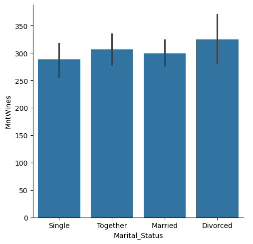
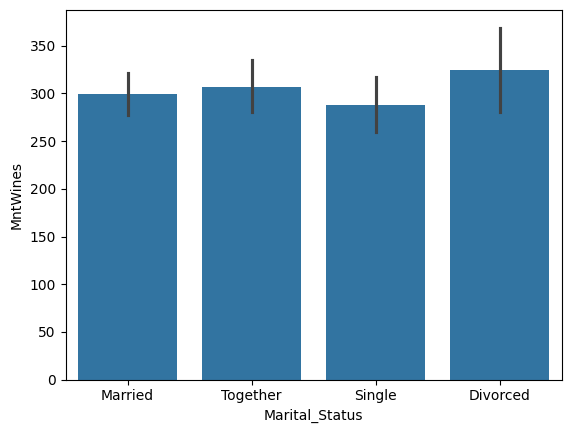
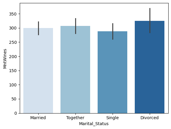
# 결혼 상태에 따른 평균 와인 소비 금액 시각화
temp = customer_df.query('Marital_Status in ["Single", "Together", "Married", "Divorced"]')
sns.catplot(kind='bar', data=temp, x='Marital_Status', y='MntWines')
1
<seaborn.axisgrid.FacetGrid at 0x7afb3af62440>
1
2
3
4
5
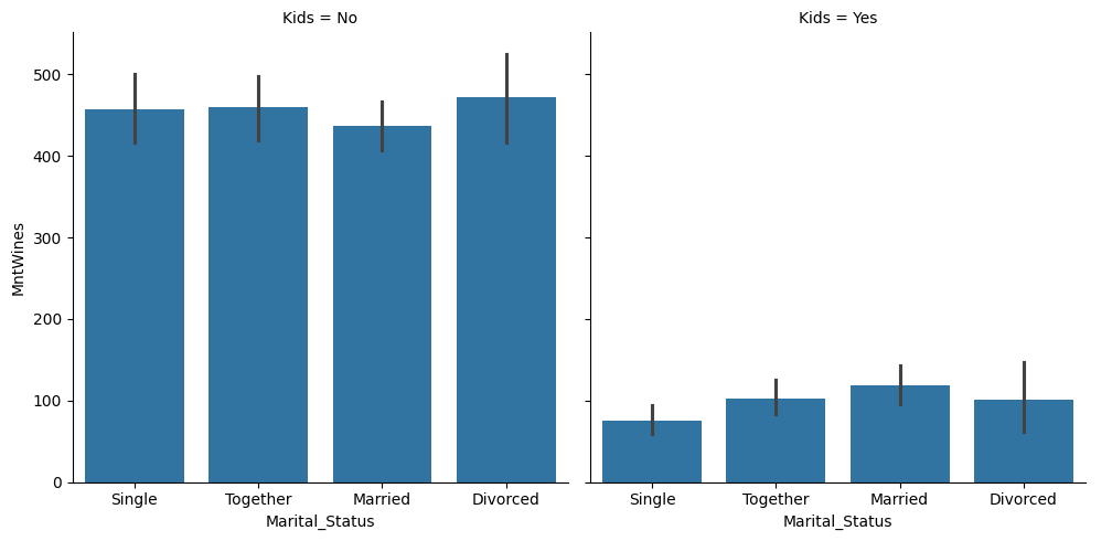
# 아이 유무에 따라 가로 방향 그래프를 분리
# 아이 수를 Yes or No 타입으로 새로 변환
temp['Kids'] = temp['Kidhome'].apply(lambda x: 'Yes' if x >= 1 else 'No')
sns.catplot(kind='bar', data=temp, x='Marital_Status', y='MntWines', col='Kids')
1
2
3
4
5
6
7
8
9
10
11
12
<ipython-input-9-195a5b59779a>:3: SettingWithCopyWarning:
A value is trying to be set on a copy of a slice from a DataFrame.
Try using .loc[row_indexer,col_indexer] = value instead

See the caveats in the documentation: https://pandas.pydata.org/pandas-docs/stable/user_guide/indexing.html#returning-a-view-versus-a-copy
  temp['Kids'] = temp['Kidhome'].apply(lambda x: 'Yes' if x >= 1 else 'No')


<seaborn.axisgrid.FacetGrid at 0x7afb3a7163b0>
1
2
3
4
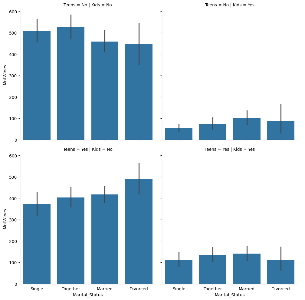
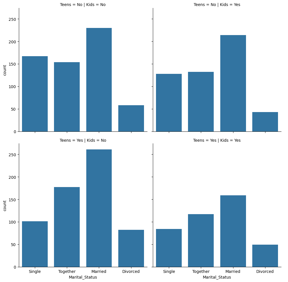
# 10대 자녀 유무도 추가해서 시각화
temp['Teens'] = temp['Teenhome'].apply(lambda x: 'Yes' if x >= 1 else 'No')
sns.catplot(kind='bar', data=temp, x='Marital_Status', y='MntWines', col='Kids', row='Teens')
1
2
3
4
5
6
7
8
9
10
11
12
<ipython-input-10-1fcbf46cd774>:2: SettingWithCopyWarning:
A value is trying to be set on a copy of a slice from a DataFrame.
Try using .loc[row_indexer,col_indexer] = value instead

See the caveats in the documentation: https://pandas.pydata.org/pandas-docs/stable/user_guide/indexing.html#returning-a-view-versus-a-copy
  temp['Teens'] = temp['Teenhome'].apply(lambda x: 'Yes' if x >= 1 else 'No')


<seaborn.axisgrid.FacetGrid at 0x7afb3d2da740>
Count plot
- 데이터의 수를 세주는 그래프 함수이기 때문에 x나 y중 하나의 값만 받는다
1
2
# 결혼 상태별 인원수를 아이 유무와 10대 자녀 유무에 따라 나누어 집계
sns.catplot(data=temp, x='Marital_Status', kind='count', col='Kids', row='Teens')
1
<seaborn.axisgrid.FacetGrid at 0x7afb3a7153c0>
Strip plot
1
2
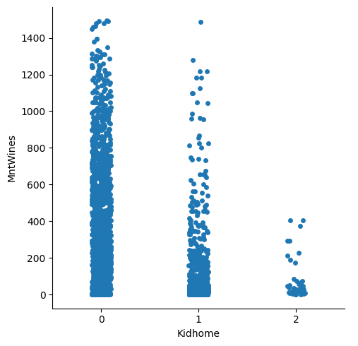
# 아이 수에 따른 와인 소비 금액의 분포 파악
sns.catplot(data=customer_df, x='Kidhome', y='MntWines', kind='strip')
1
<seaborn.axisgrid.FacetGrid at 0x7afb3a3bb400>
박스 플롯
1
2
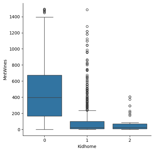
sns.catplot(data=customer_df, x='Kidhome', y='MntWines', kind='box')
# 아이가 1명 이상 있는 집에서 와인 소비 금액의 중앙값이 훨씬 작은것을 관찰할 수 있다
1
<seaborn.axisgrid.FacetGrid at 0x7afb39bb73a0>
바이올린 플롯
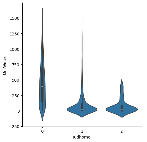
1
sns.catplot(data=customer_df, x='Kidhome', y='MntWines', kind='violin')
1
<seaborn.axisgrid.FacetGrid at 0x7afb39c5dde0>
relplot() 함수
- relational plot의 줄임으로 두 연속형 변수 사이의 관계를 나타내는데 적합한 함수
- kind 옵션은 scatter와 line 2가지가 있다
산점도(Scatter plot)
1
2
exam_df = pd.read_csv('/content/drive/MyDrive/data/student_exam.csv')
exam_df.head()
| gender | race/ethnicity | parental level of education | lunch | test preparation course | math score | reading score | writing score | |
|---|---|---|---|---|---|---|---|---|
| 0 | female | group B | bachelor's degree | standard | none | 72 | 72 | 74 |
| 1 | female | group C | some college | standard | completed | 69 | 90 | 88 |
| 2 | female | group B | master's degree | standard | none | 90 | 95 | 93 |
| 3 | male | group A | associate's degree | free/reduced | none | 47 | 57 | 44 |
| 4 | male | group C | some college | standard | none | 76 | 78 | 75 |
1
2
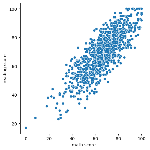
# 수학 점수와 읽기 점수의 관계
sns.relplot(data=exam_df, x='math score', y='reading score', kind='scatter')
1
<seaborn.axisgrid.FacetGrid at 0x7afb399c3130>
1
2
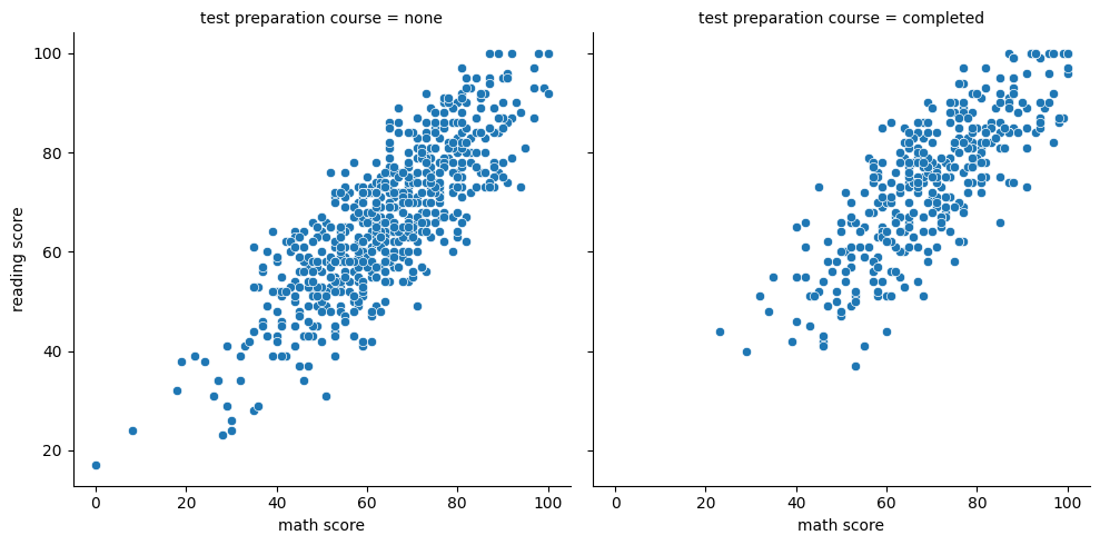
# 테스트 준비 과정의 이수 여부에 따라 수학 점수와 읽기 점수의 관계
sns.relplot(data=exam_df, x='math score', y='reading score', kind='scatter', col='test preparation course')
1
<seaborn.axisgrid.FacetGrid at 0x7afb39a5aad0>
라인 그래프
1
2
books_df = pd.read_csv('/content/drive/MyDrive/data/amazon_bestsellers.csv')
books_df.head()
| Name | Author | User Rating | Reviews | Price | Year | Genre | |
|---|---|---|---|---|---|---|---|
| 0 | 10-Day Green Smoothie Cleanse | JJ Smith | 4.7 | 17350 | 8 | 2016 | Non Fiction |
| 1 | 11/22/63: A Novel | Stephen King | 4.6 | 2052 | 22 | 2011 | Fiction |
| 2 | 12 Rules for Life: An Antidote to Chaos | Jordan B. Peterson | 4.7 | 18979 | 15 | 2018 | Non Fiction |
| 3 | 1984 (Signet Classics) | George Orwell | 4.7 | 21424 | 6 | 2017 | Fiction |
| 4 | 5,000 Awesome Facts (About Everything!) (Natio... | National Geographic Kids | 4.8 | 7665 | 12 | 2019 | Non Fiction |
1
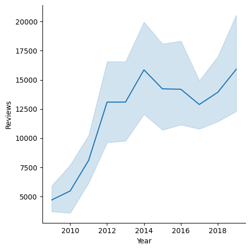
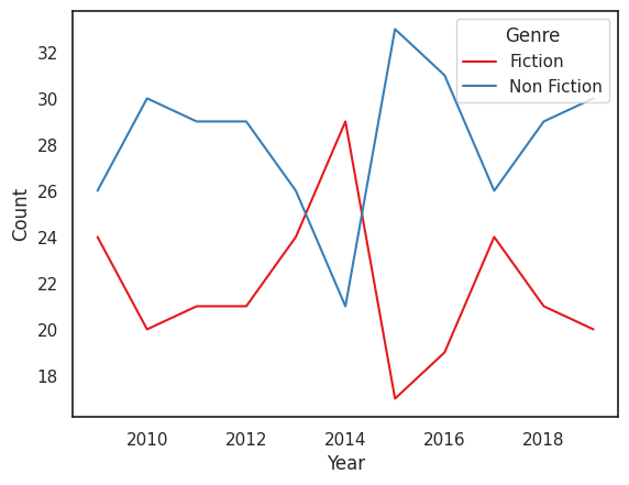
sns.relplot(kind='line', x='Year', y='Reviews', data=books_df)
1
<seaborn.axisgrid.FacetGrid at 0x7afb39971960>
1
2
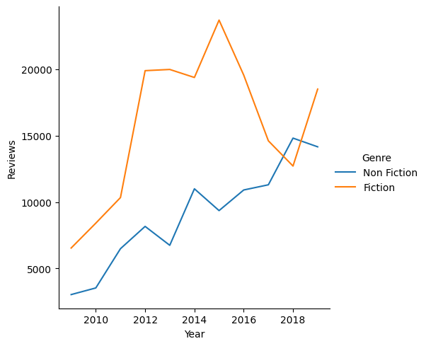
# 오차 영역 표시를 숨기고 hue 파라미터를 통해 특정 장르별 데이터 시각화
sns.relplot(kind='line', x='Year', y='Reviews', data=books_df, errorbar=None, hue='Genre')
1
<seaborn.axisgrid.FacetGrid at 0x7afb31f4b190>
displot() 함수
- distribution plot의 줄임으로 데이터의 분포를 시각화하는데 적합한 함수
- kind 옵션 : hist, kde, ecdf
히스토그램
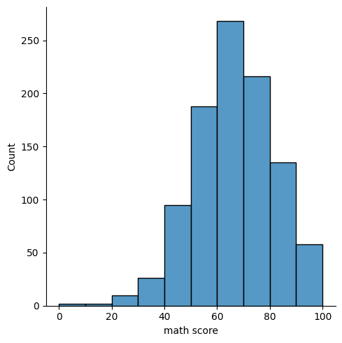
1
sns.displot(data=exam_df, x='math score', kind='hist')
1
<seaborn.axisgrid.FacetGrid at 0x7afb31f25f90>

1
2
# bins 파라미터 이용 구간 조정
sns.displot(data=exam_df, x='math score', kind='hist', bins=10)
1
<seaborn.axisgrid.FacetGrid at 0x7afb31e47520>
1
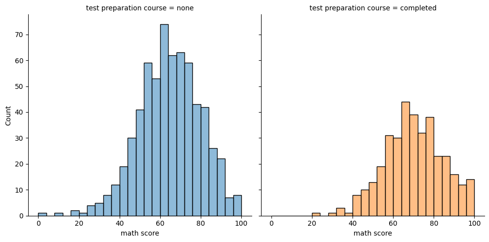
2
# 테스트 준비 과정 여부로 분포 분류
sns.displot(data=exam_df, x='math score', kind='hist', col='test preparation course', hue='test preparation course', legend=False)
1
<seaborn.axisgrid.FacetGrid at 0x7afb39bb6b00>
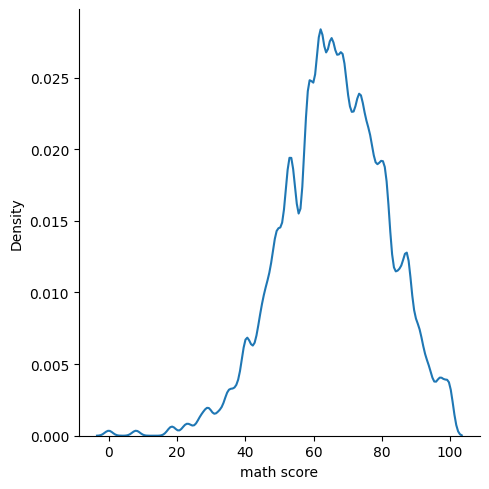
KDE plot
1
sns.displot(data=exam_df, x='math score', kind='kde', bw_adjust=0.3)
1
<seaborn.axisgrid.FacetGrid at 0x7afb31ff98a0>
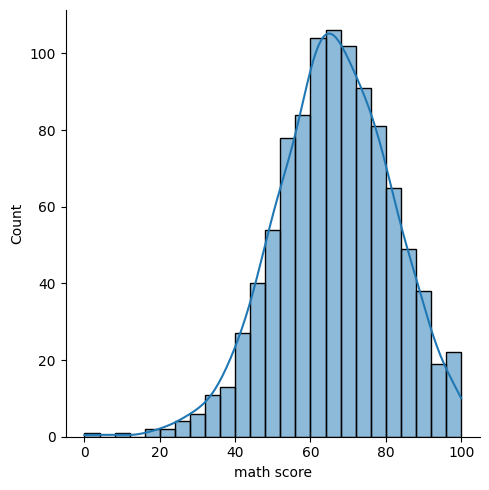
히스토그램과 KDE plot 함께 그리기 (kde=True옵션)
1
sns.displot(data=exam_df, kind='hist', kde=True, x='math score')
1
<seaborn.axisgrid.FacetGrid at 0x7afb31caf550>
두 개의 변수로 분포 시각화하기
1
sns.displot(kind='hist', data=exam_df, x='math score', y='reading score')
1
<seaborn.axisgrid.FacetGrid at 0x7afb31b455d0>

1
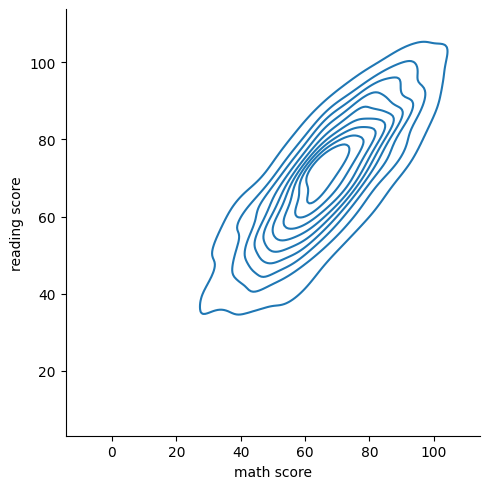
sns.displot(data=exam_df, kind='kde', x='math score', y='reading score')
1
<seaborn.axisgrid.FacetGrid at 0x7afb31b45f30>
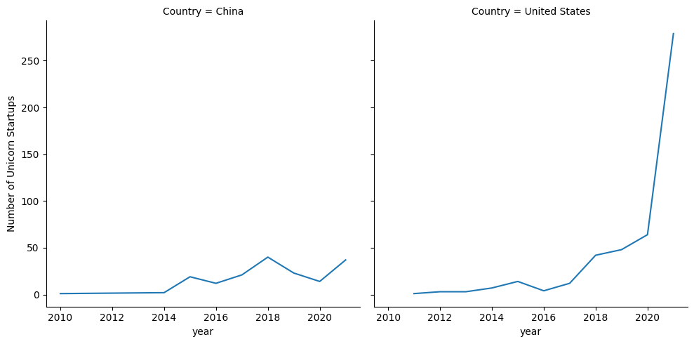
실습 : 연도별 유니콘 스타트업 수 시각화
- 연도별 국가별 기업수를 집계할 때, 기업수를 집계한 컬럼명은 ‘Number of Unicorn Startups’로 바꿔주세요.
- 국가 중에서는 중국과 미국만 필터링해 사용하고, 그래프는 가로 방향으로 분리해 그려 주세요.
1
2
unicorn_df = pd.read_csv('/content/drive/MyDrive/data/unicorn_startups.csv')
unicorn_df
| Company | Valuation | Date | Country | City | Industry | Investors | year | month | day | |
|---|---|---|---|---|---|---|---|---|---|---|
| 0 | Bytedance | 140.0 | 4/7/2017 | China | Beijing | Artificial intelligence | 0 Sequoia Capital China, SIG Asia Investm... | 2017 | 7 | 4 |
| 1 | SpaceX | 100.3 | 12/1/2012 | United States | Hawthorne | Other | 0 Sequoia Capital China, SIG Asia Investm... | 2012 | 1 | 12 |
| 2 | Stripe | 95.0 | 1/23/2014 | United States | San Francisco | Fintech | 0 Sequoia Capital China, SIG Asia Investm... | 2014 | 23 | 1 |
| 3 | Klarna | 45.6 | 12/12/2011 | Sweden | Stockholm | Fintech | 0 Sequoia Capital China, SIG Asia Investm... | 2011 | 12 | 12 |
| 4 | Canva | 40.0 | 1/8/2018 | Australia | Surry Hills | Internet software & services | 0 Sequoia Capital China, SIG Asia Investm... | 2018 | 8 | 1 |
| ... | ... | ... | ... | ... | ... | ... | ... | ... | ... | ... |
| 931 | YipitData | 1.0 | 12/6/2021 | United States | New York | Internet software & services | 0 Sequoia Capital China, SIG Asia Investm... | 2021 | 6 | 12 |
| 932 | Anyscale | 1.0 | 12/7/2021 | United States | Berkeley | Artificial Intelligence | 0 Sequoia Capital China, SIG Asia Investm... | 2021 | 7 | 12 |
| 933 | Iodine Software | 1.0 | 12/1/2021 | United States | Austin | Data management & analytics | 0 Sequoia Capital China, SIG Asia Investm... | 2021 | 1 | 12 |
| 934 | ReliaQuest | 1.0 | 12/1/2021 | United States | Tampa | Cybersecurity | 0 Sequoia Capital China, SIG Asia Investm... | 2021 | 1 | 12 |
| 935 | Pet Circle | 1.0 | 12/7/2021 | Australia | Alexandria | E-commerce & direct-to-consumer | 0 Sequoia Capital China, SIG Asia Investm... | 2021 | 7 | 12 |
936 rows × 10 columns
1
2
3
4
unicorn_groupby = unicorn_df.groupby(['year', 'Country'])[['Company']].count().reset_index()
unicorn_groupby = unicorn_groupby.rename(columns={'Company' : 'Number of Unicorn Startups'})
select_unicorn = unicorn_groupby.query('Country in ["China", "United States"]')
sns.relplot(kind='line', data=select_unicorn, x='year', y='Number of Unicorn Startups', col='Country')
1
<seaborn.axisgrid.FacetGrid at 0x7afb39b8c970>
Axes-level 그래프 커스터마이징
막대그래프 파라미터 사용하기
- 값의 순서 조정하기 : order 파라미터에 리스트 형태로 정리
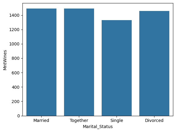
1
sns.barplot(data=temp, x='Marital_Status', y='MntWines', order=['Married', 'Together', 'Single', 'Divorced'])
1
<Axes: xlabel='Marital_Status', ylabel='MntWines'>
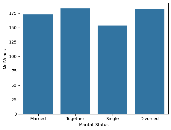
- estimator 변경하기 : 지표를 평균값(기본값), 중앙값 등으로 변경
1
sns.barplot(data=temp, x='Marital_Status', y='MntWines', order=['Married', 'Together', 'Single', 'Divorced'], estimator='median', errorbar=None)
1
<Axes: xlabel='Marital_Status', ylabel='MntWines'>
1
2
# 최대값 기준
sns.barplot(data=temp, x='Marital_Status', y='MntWines', order=['Married', 'Together', 'Single', 'Divorced'], estimator='max', errorbar=None)
1
<Axes: xlabel='Marital_Status', ylabel='MntWines'>
- 그래프 꾸미기 : palette 파라미터로 테마색 조정
- 테마색에
_d가 붙으면 조금 더 어둡게 표현되고,_r이 붙으면 색상 순서가 거꾸로 뒤집힌다
- 테마색에
1
sns.barplot(data=temp, x='Marital_Status', y='MntWines', order=['Married', 'Together', 'Single', 'Divorced'], palette='Blues')
1
2
3
4
5
6
7
8
9
10
11
<ipython-input-33-c11b1b66f8b8>:1: FutureWarning:

Passing `palette` without assigning `hue` is deprecated and will be removed in v0.14.0. Assign the `x` variable to `hue` and set `legend=False` for the same effect.

  sns.barplot(data=temp, x='Marital_Status', y='MntWines', order=['Married', 'Together', 'Single', 'Divorced'], palette='Blues')


<Axes: xlabel='Marital_Status', ylabel='MntWines'>
라인그래프 커스터마이징
1
2
3
4
5
6
7
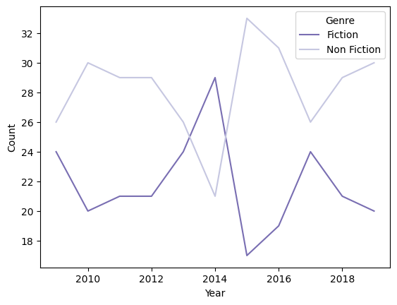
# 연도별 장르별 베스트셀러 수
books_groupby = books_df.groupby(['Year', 'Genre'])[['Name']].count().reset_index()
books_groupby.rename(columns={'Name':'Count'}, inplace=True)
# 라인 그래프
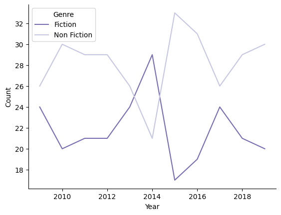
sns.lineplot(data=books_groupby, x='Year', y='Count', hue='Genre', palette='Purples_r')
1
<Axes: xlabel='Year', ylabel='Count'>
- Spine 제거하기 : despine() 함수
- 기본값 : top=True, right=True
1
2
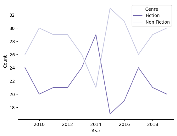
sns.lineplot(data=books_groupby, x='Year', y='Count', hue='Genre', palette='Purples_r')
sns.despine()
- 범례 옮기기 : move_legend
1
2
3
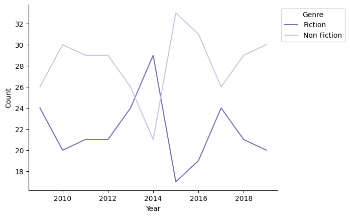
ax = sns.lineplot(data=books_groupby, x='Year', y='Count', hue='Genre', palette='Purples_r')
sns.move_legend(ax, "upper left")
sns.despine()
1
2
3
4
# 범례 바깥쪽으로 빼기
ax = sns.lineplot(data=books_groupby, x='Year', y='Count', hue='Genre', palette='Purples_r')
sns.move_legend(ax, 'upper left', bbox_to_anchor=(1, 1))
sns.despine()
- 전체 그래프 설정 변경하기 : sns.set_style()
- 기본 제공 스타일 : darkgrid, whitegrid, dark, white, ticks
1
2
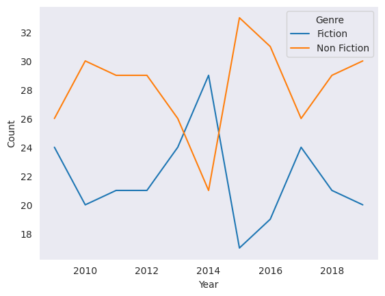
sns.set_style('dark')
sns.lineplot(data=books_groupby, x='Year', y='Count', hue='Genre')
1
<Axes: xlabel='Year', ylabel='Count'>
- 전체 실행 환경의 팔레트를 일괄적으로 바꾸는 함수 : set_palette()
1
2
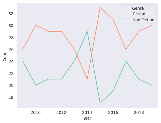
sns.set_palette('Set2')
sns.lineplot(data=books_groupby, x='Year', y='Count', hue='Genre')
1
<Axes: xlabel='Year', ylabel='Count'>
- set_theme : set_style과 set_palette를 한번에 적용
- ex) sns.set_theme(style=’white’, palette=’Set1’)
1
2
sns.set_theme(style='white', palette='Set1')
sns.lineplot(data=books_groupby, x='Year', y='Count', hue='Genre')
1
<Axes: xlabel='Year', ylabel='Count'>
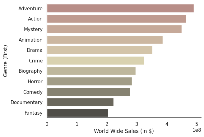
데이터실습 : Axes-level 그래프 사용, 할리우드 영화 장르별 평균 글로벌 매출 시각화
- 영화의 장르를 판단할 때는 Genre (First) 컬럼을 기준으로 사용해 주세요.
- 글로벌 매출의 평균값이 가장 큰 장르부터 작은 장르까지 내림차순으로 막대를 정렬해 주세요.
- errorbar는 없애주세요.
- 팔레트는 pink_d 그리고 스타일은 whitegrid를 사용해 주세요.
- 상단과 우측의 Spine은 제거해 주세요.
1
2
3
4
5
6
7
movie_df = pd.read_csv('/content/drive/MyDrive/data/highest_grossing_movies.csv')
movie_df_genre = movie_df.groupby('Genre (First)')[['World Wide Sales (in $)']].mean().sort_values(by='World Wide Sales (in $)', ascending=False)
movie_df_genre = movie_df_genre.reset_index()  # 인덱스를 재설정하여 'Genre (First)'를 다시 열로 만듭니다.

sns.barplot(data=movie_df_genre, y='Genre (First)', x='World Wide Sales (in $)', errorbar=None, palette='pink_d')
sns.set_theme(style='whitegrid')
sns.despine()
1
2
3
4
5
<ipython-input-41-430fc81c82ac>:5: FutureWarning:

Passing `palette` without assigning `hue` is deprecated and will be removed in v0.14.0. Assign the `y` variable to `hue` and set `legend=False` for the same effect.

  sns.barplot(data=movie_df_genre, y='Genre (First)', x='World Wide Sales (in $)', errorbar=None, palette='pink_d')
Matplotlib 기반 그래프 커스터마이징
State-based 인터페이스
- seaborn의 Axes-level 함수 그래프는 Matplotlib의 Axes 객체이기 때문에 동일하게 커스터마이징할 수 있다
1
2
3
4
5
6
7
8
9
10
11
12
13
14
15
16
17
18
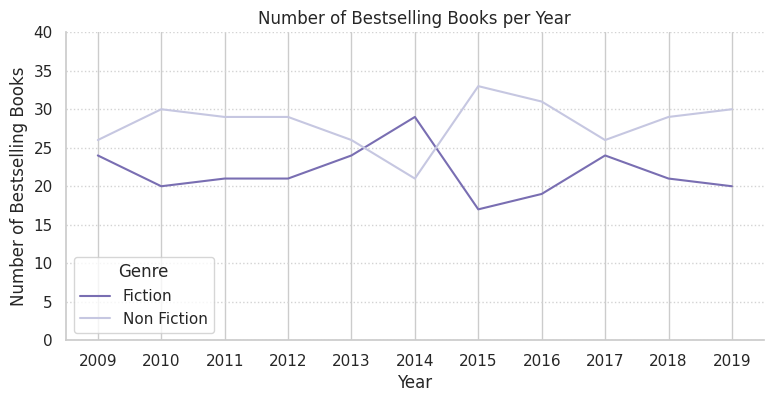
import seaborn as sns
import matplotlib.pyplot as plt
# 연도별 장르별 베스트셀러 수
books_groupby = books_df.groupby(['Year', 'Genre'])[['Name']].count().reset_index()
plt.figure(figsize=(9, 4))
sns.lineplot(data=books_groupby, x='Year', y='Name', hue='Genre', palette='Purples_r')
sns.despine()
plt.title('Number of Bestselling Books per Year') # 제목 붙이기
plt.ylabel('Number of Bestselling Books') # y축 라벨 변경
plt.ylim([0, 40]) # y축 표시 범위를 0 ~ 40으로 조정
plt.xticks(books_groupby['Year'].unique()) # x축에 연도가 모두 표시되도록 조정
plt.grid(axis='y', linestyle=':', color='lightgrey') # y축에만 Grid 추가: 점선 스타일, 연회색
Object-oriented 인터페이스
- plt.subplots() 로 Figure와 Axes를 만들어준 후에, 이 Axes에 대한 정보를 seaborn Axes-level 그래프의 ax 파라미터에 넘겨줌
1
2
3
4
5
6
7
8
9
10
11
12
13
figure, ax = plt.subplots(figsize=(9, 4))

sns.lineplot(data=books_groupby, x='Year', y='Name', hue='Genre', palette='Purples_r', ax=ax)
sns.despine()

ax.set_title('Number of Bestselling Books per Year') # 제목 붙이기
ax.set_ylabel('Number of Bestselling Books') # y축 라벨 변경

ax.set_ylim([0, 40])  # y축 표시 범위를 0~40으로 조정
ax.set_xticks(books_groupby['Year'].unique())  # x축에 연도가 모두 표시되도록 조정

ax.grid(axis='y', linestyle=':', color='lightgrey') # y축에만 Grid 추가: 점선 스타일, 연회색

Object-oriented 인터페이스로 여러 개의 Axes 다루기
- subplots()로 figure와 두 개의 axes를 생성한 후, 각각의 seaborn 그래프 함수의
ax파라미터 대응
1
2
3
4
5
6
7
8
9
10
11
12
13
14
15
16
17
18
19
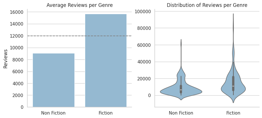
fig, ax = plt.subplots(1, 2, figsize=(9, 4), constrained_layout=True)
sns.set_palette('Blues_d') # 팔레트 설정
sns.barplot(data=books_df, x='Genre', y='Reviews', errorbar=None, ax=ax[0]) # errorbar는 숨김 처리
sns.violinplot(data=books_df, x='Genre', y='Reviews', ax=ax[1])
sns.despine() # 두 개 그래프에 다 적용됨
for axes in ax:
axes.set_xlabel('') # x축 라벨 숨기기
# ax[0] 가공하기
ax[0].set_title('Average Reviews per Genre') # 제목 붙이기
ax[0].axhline(books_df['Reviews'].mean(), color='grey', linestyle='--') # 평균선 추가하기
# ax[1] 가공하기
ax[1].set_title('Distribution of Reviews per Genre') # 제목 붙이기
ax[1].set_ylabel('') # y축 라벨 숨기기
1
Text(0, 0.5, '')
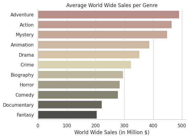
실습 문제 : 할리우드 영화의 장르별 평균 글로벌 매출을 막대그래프로 시각화
- 실습 가이드
- 기본적인 막대그래프는 아래 가이드에 따라 그려 주세요. 할리우드 영화 장르별 매출 시각화 I 실습에서 완성한 코드를 기반으로 하므로, 앞선 실습에서 작성한 코드를 가져와 기반으로 사용하셔도 무방해요.
- 영화의 장르를 판단할 때는 Genre (First) 컬럼을 기준으로 사용해 주세요.
- 글로벌 매출의 평균값이 가장 큰 장르부터 작은 장르까지 내림차순으로 막대를 정렬해 주세요.
- errorbar는 없애주세요.
- 팔레트는 pink_d 그리고 스타일은 whitegrid를 사용해 주세요.
- 상단과 우측의 Spine은 제거해 주세요.
- ‘Average World Wide Sales per Genre’라는 제목을 추가해 주세요.
- 어차피 y축이 장르라는 사실은 명시적이므로 y축 라벨은 지워주세요.
- x축 눈금의 라벨을 million 단위로 잘라서 넣어주세요.
- 이 내용은 조금 어려울 수 있습니다. 이전 챕터의 K-pop 아이돌의 인스타그램 팔로워 수 시각화 II 실습 중 해설 마지막 부분에서 언급된 axis.set_major_formatter()에 대한 설명을 참고해서 구현해 주세요.
- x축 라벨은 ‘World Wide Sales (in Million $)’로 변경해 주세요.
- 기본적인 막대그래프는 아래 가이드에 따라 그려 주세요. 할리우드 영화 장르별 매출 시각화 I 실습에서 완성한 코드를 기반으로 하므로, 앞선 실습에서 작성한 코드를 가져와 기반으로 사용하셔도 무방해요.
1
2
3
4
5
6
7
8
9
10
11
12
13
import matplotlib.pyplot as plt
import matplotlib.ticker as ticker
movie_df = pd.read_csv('/content/drive/MyDrive/data/highest_grossing_movies.csv')
movie_df_genre = movie_df.groupby('Genre (First)')[['World Wide Sales (in $)']].mean().sort_values(by='World Wide Sales (in $)', ascending=False).reset_index()

fig, ax = plt.subplots()
sns.barplot(data=movie_df_genre, y='Genre (First)', x='World Wide Sales (in $)', errorbar=None, palette='pink_d')
sns.set_theme(style='whitegrid')
sns.despine()
ax.set_title('Average World Wide Sales per Genre')
ax.set_ylabel('')
ax.xaxis.set_major_formatter(ticker.FuncFormatter(lambda x, p: int(x / 1e6)))
ax.set_xlabel('World Wide Sales (in Million $)')
1
2
3
4
5
6
7
8
9
10
11
<ipython-input-63-d2eef6cf9fb6>:7: FutureWarning:

Passing `palette` without assigning `hue` is deprecated and will be removed in v0.14.0. Assign the `y` variable to `hue` and set `legend=False` for the same effect.

  sns.barplot(data=movie_df_genre, y='Genre (First)', x='World Wide Sales (in $)', errorbar=None, palette='pink_d')


Text(0.5, 0, 'World Wide Sales (in Million $)')
This post is licensed under CC BY 4.0 by the author.